
Tableau Dashboard Viz Glow Up –
1-Hour Dashboard Design & Visualisation Review
Get practical, design-first feedback to make your Tableau dashboard clearer, more compelling, and more likely to be used across every device and screen.
TL;DR
Dub Dub Data’s Tableau Viz Glow Up is a 1-hour, design-first dashboard review that turns cluttered, under-used dashboards in Tableau into clear, executive-ready decision informed tools - without rebuilding the workbook. You’ll get practical, live coaching on data visualisations, dashboard design, storytelling, and interactivity - plus a recording, transcript, and notes the same day to help you fix what matters most. It’s ideal if you need higher dashboard adoption, clearer insight, or a trusted second set of eyes for portfolios, interviews, and study projects - with public before-and-after examples you can view on Tableau Public.
Improve Design, Trust, and Adoption in Tableau.
Fix the Dashboard No One UsesWhy Tableau Viz Glow Ups Matter
In today’s data-rich organisations, dashboard content is everywhere - but insight is not. Many Tableau dashboards are built quickly to meet an immediate need, then left untouched as business questions evolve - even when the underlying data changes. Over time, the layout becomes cluttered, the visual hierarchy breaks down, and the dashboard becomes under-used - limiting confident, data-informed decisions.
Tableau Viz Glow Ups address this gap. We take your existing dashboards and elevate them through proven data visualisation best practices, human-centred design, and a deep understanding of how leaders actually consume information. The result is clearer insights, stronger engagement, and dashboards that tell a compelling story - without rebuilding from scratch.
Whether your dashboards suffer from low adoption, visual noise, poor performance, or misalignment with business priorities, a Viz Glow Up helps unlock the full value of the work you’ve already invested in Tableau. We don’t just make dashboards look better - we make them work better.

Who Needs a Tableau Dashboard Review?
A Viz Glow Up session is ideal if:
-
Your dashboard feels messy, cluttered, or hard to follow
-
You need it to be executive-ready (clear, scannable, decision-focused)
-
No one is using your dashboards and you want to understand why
-
You’re preparing for a portfolio, interview, or promotion and want your work to stand out
-
You want a trusted “second set of eyes” from experienced Tableau practitioners
- You are a student and need coaching for your Tableau project
Public Examples of “Viz Glow Ups”
While we can’t share client work, here are two public examples of the kind of improvement you can expect.
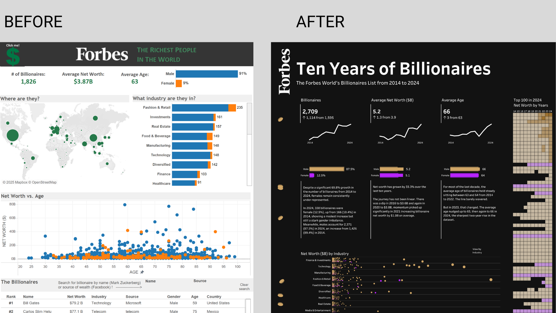
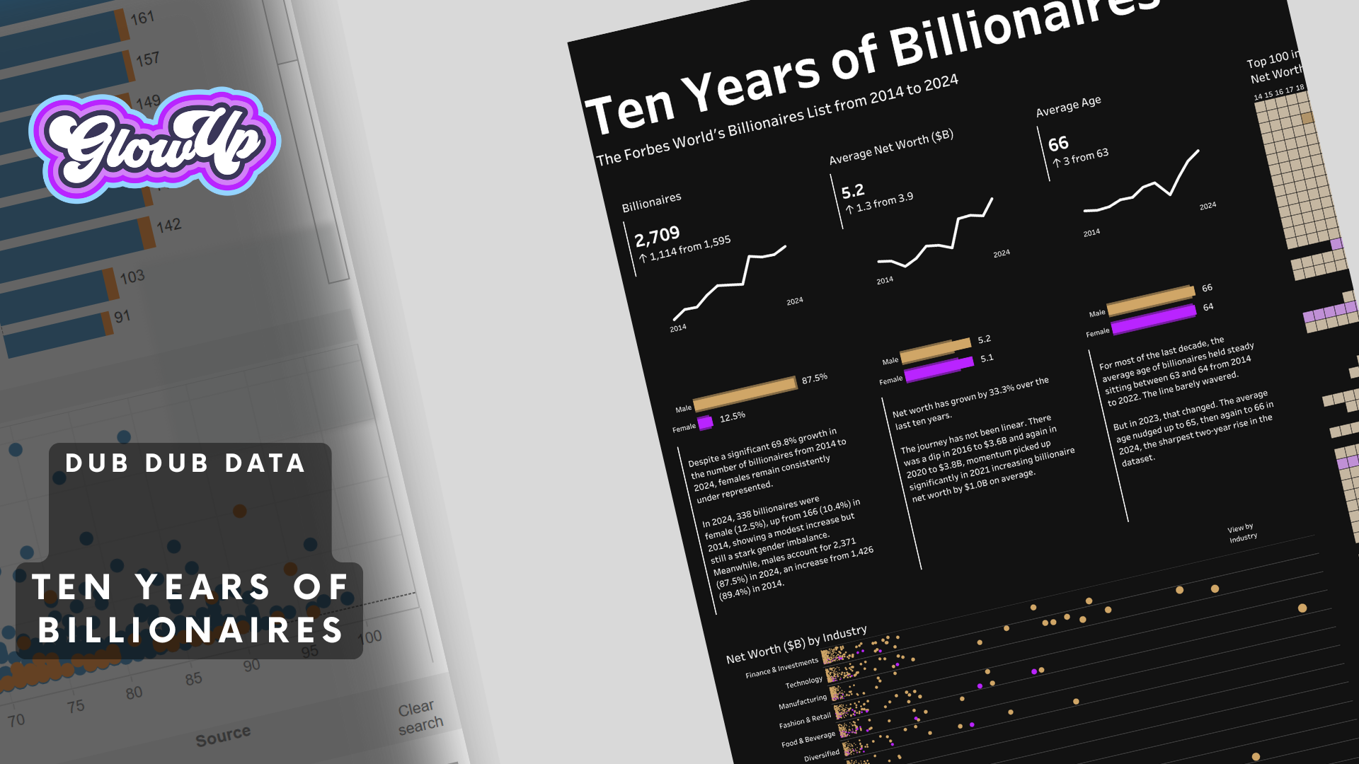
Forbes Billionaires Tableau Dashboard Glow Up
For organisations striving to turn raw data into meaningful insight, even well-built dashboards can fall short as design standards and audience expectations evolve. Our Forbes Billionaires Tableau Viz Glow Up demonstrates this evolution - taking a solid 2015 visualisation and transforming it into a 2025-ready, accessible, story-centric dashboard that goes beyond functional to truly impactful. By incorporating historical trends, clear narratives, thoughtful accessibility, and purposeful design choices, this Glow Up shows how elevating an existing dashboard can unlock deeper understanding, stronger engagement, and a richer experience for decision-makers. You can learn more about the Glow Up, here.
Citi Bike Tableau Dashboard Glow Up
Our Citi Bike Viz Glow Up shows how under-utilised dashboards can be transformed into high-impact decision tools. By redesigning a popular Citi Bike Tableau dashboard, we cut through visual clutter, improved accessibility, and refocused the experience around the questions users actually need answered. The result is a cleaner, faster, and more intuitive dashboard that builds trust, increases adoption, and helps stakeholders get value from data without extra training or rework. This is what happens when good data meets great design – and why Glow Ups deliver a fast return on your existing Tableau investment.
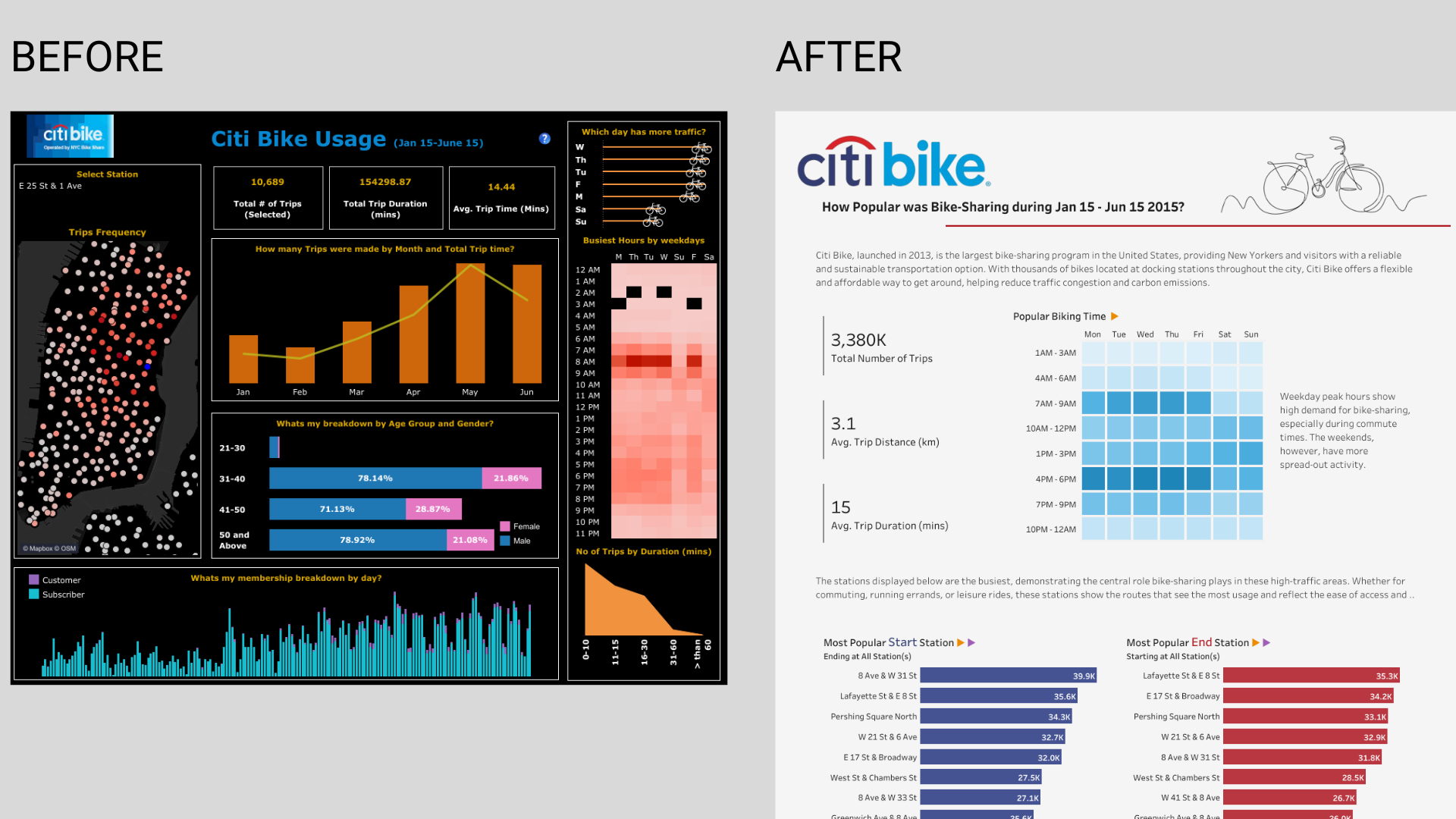
Citi Bike Before & After Interactive Dashboards
Book Your Viz Glow Up nowOur Approach to Tableau Viz Glow Ups
Viz Glow Ups aren’t about surface-level feedback or generic design tips. They’re a high-impact review led by experienced practitioners who understand how a Tableau dashboard is built, used, and judged - in Tableau Desktop and on the web.
Our approach is deliberately hands-on and practical. You bring your dashboard into a live session, and we review it in context – purpose, audience, interactivity, constraints, and target device (desktop, tablet, or phone). We coach you through dashboard design and data visualisations in real time - what to change, why it matters, and how it improves clarity, trust, and dashboard adoption in Tableau
Each Glow Up is designed to deliver immediate value with changes you can apply automatically using smart defaults and consistent structure. We focus on the biggest-impact changes first - like selecting effective charts, reducing object clutter with white space, highlighting insights, and tightening size rules - while respecting your non-negotiables. You’ll walk away with clear guidance, a session recording, transcript, and notes - including what to align, what to resize, and where a single pixel shift improves trust.
If you’re working with sensitive data, we’re happy to operate under NDA and review your workbook safely. Our goal is simple: turn the dashboard you already have into a decision-informed asset that actually gets used.
Maps, bar charts, even layouts for different device types. Anything goes! Your stakeholders will understand the power of data with your well-designed content.

During the Session
- We’ll validate map usage, bar chart readability, and whether a chart choice matches the category of question being asked.
- We’ll help you select interactions (filters, highlights, navigation) that feel intuitive and reduce friction.
- We’ll check border consistency, spacing, and white space so the final result feels neat and supports neatness.
- We’ll review sheet and worksheet choices, then connect the story onto the dashboard with a clearer narrative.
- We’ll recommend when to use tile vs floating objects to improve consistency, and how a fixed size approach improves performance .
- We can discuss dashboards that work across desktop and mobile by using see create dashboard layouts principles, including create dashboard layouts for different audiences and layouts for different device types.
Learn, Improve, and Lead with Tableau Dashboards
Build Stronger Data Visualisation and Dashboard Design Capability
Discover practical insights, real-world examples, and Tableau dashboard design best practice that help improve dashboard adoption, clarity, and trust. Our Viz Glow Up blogs unpack dashboard redesigns, data visualisation techniques, and data storytelling approaches that turn Tableau dashboards into decision-ready assets. Learn how better dashboard design drives engagement, supports data-informed decision-making, and maximises the return on your Tableau and analytics investment.
Forbes Billionaires Tableau Viz Glow Up
Explore how a Tableau Viz Glow Up elevated the Forbes Billionaires dashboard by reducing visual noise, strengthening narrative, and aligning design to how leaders consume data. This post shares practical lessons in Tableau dashboard design that drive trust, adoption, and insight.
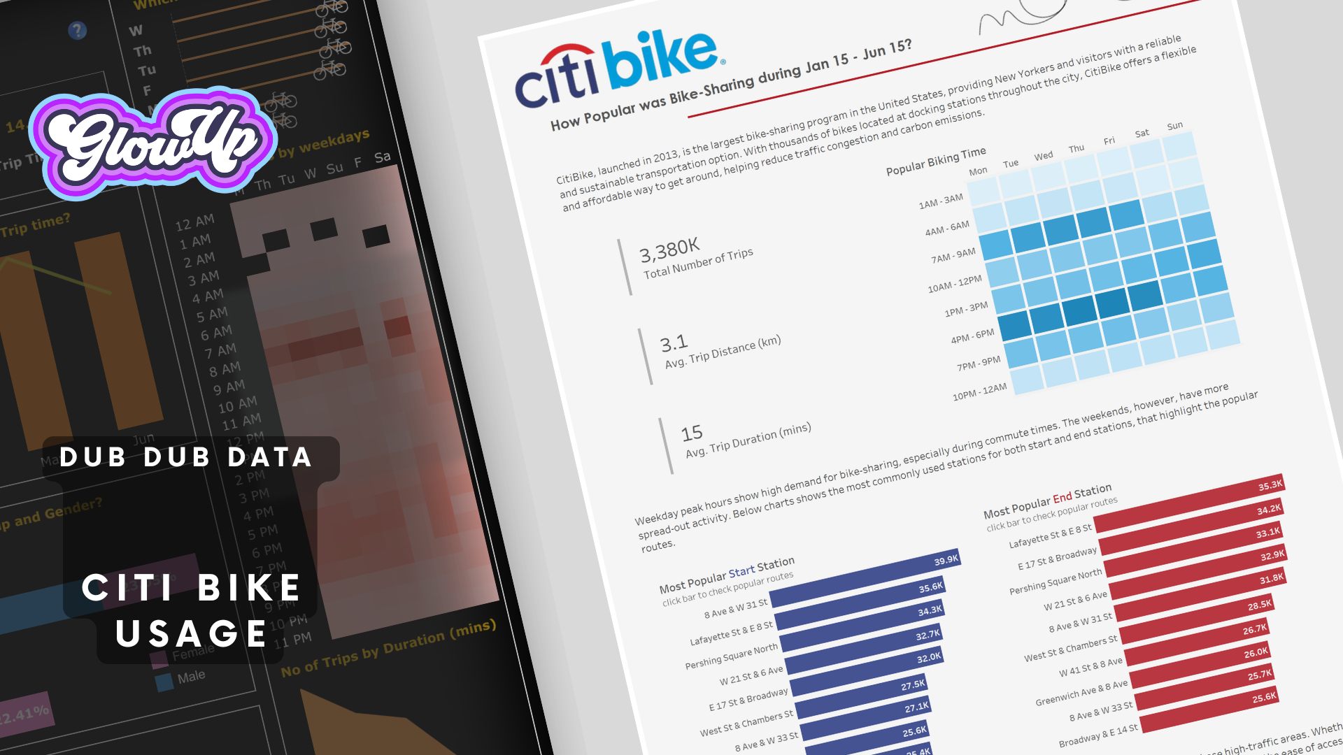
Tableau Dashboard Glow Up - Transforming Trust and Adoption
Explore how a focused dashboard redesign can improve engagement and decision confidence. This post breaks down the Citi Bike Tableau Glow Up to show how better visualisation, clearer metrics, and intentional design choices drive dashboard adoption and value across teams.

Insights on Tableau, Data Visualisation, Analytics, AI, and Data Leadership
Explore practical, real-world thinking on Tableau dashboard design, data visualisation best practice, analytics, AI, and modern data leadership. Our blog shares lessons from the field - covering dashboard adoption, data storytelling, workforce enablement, and leading data teams - to help organisations get more value from their data, dashboards, and analytics investment.
unDUBBED Podcast: Tableau Viz Glow Ups
Turn a Dashboard into Informed Decisions
Most Tableau dashboards exist - few get used, especially when the default experience is confusing.
In this unDUBBED episode, Fiona Crocker and Sarah Burnett show how a focused dashboard Viz Glow Up applies design and best practice to cut noise, increase adoption, and turn existing Tableau work into trusted decision tools

Fix the Dashboards No One Uses
Upgrade your Tableau dashboard with proven best practice and start seeing impact immediately - cleaner formats, smarter filters, and a clearer view.
Buy a Tableau Dashboard Viz Glow Up