From Good to Gold: A Forbes Billionaires Viz Glow Up That Sparkles
Jun 03, 2025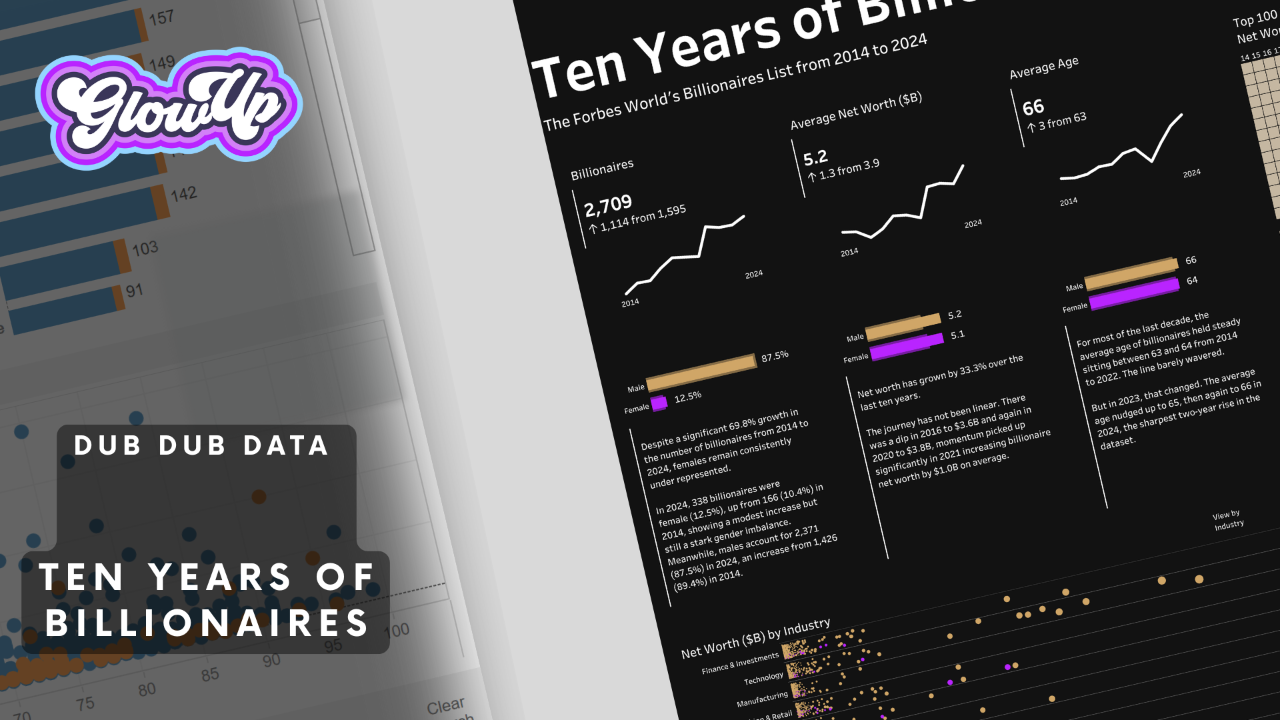
By Sarah Burnett & Fiona Crocker | Co-Founders, Dub Dub Data
Sometimes the best projects start with a simple question:
"What if we made this better?"
That's exactly what happened when we found Dan's Forbes Billionaires visualisation. Don't get us wrong - Dan's original work was solid. Clean layout, consistent colours, everything visible on one screen. But as Fi and I worked through our review, we realised this was the perfect candidate for a viz glow up.
The Original: A 2015 Masterpiece (And Why Context Matters)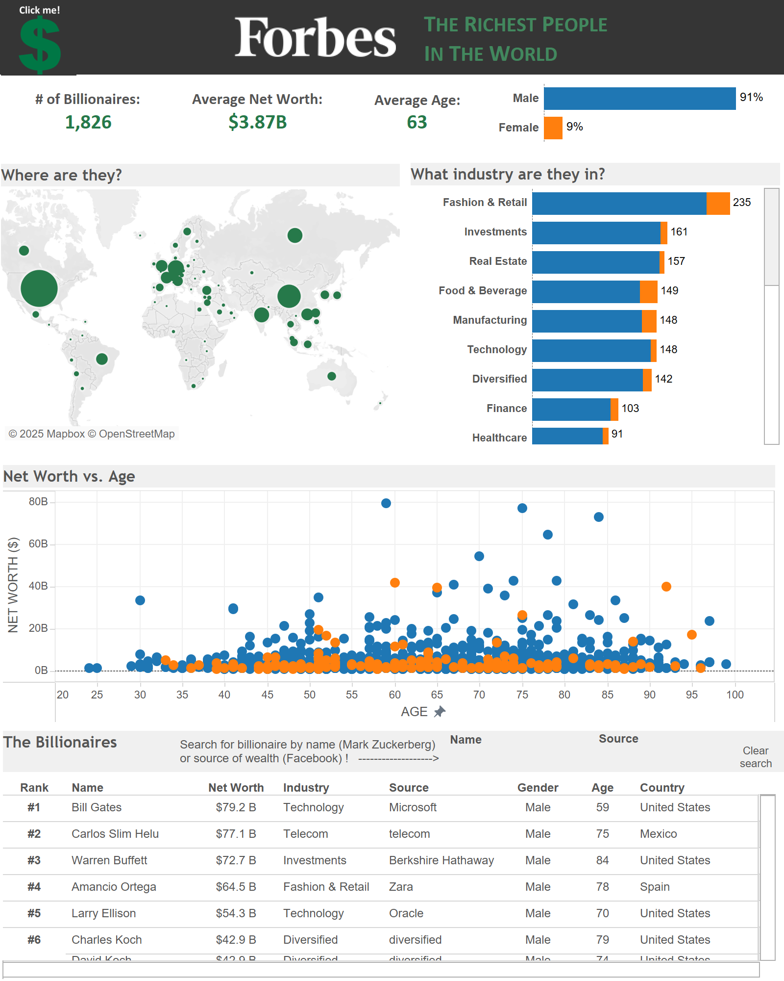
You can view a copy of Dan's original here, we needed to fix the tde as his link is broken
Let's be crystal clear about something: Dan's visualisation was brilliant for 2015. We're talking about a time when Tableau was still finding its feet, when most dashboards looked like Excel spreadsheets with fancy colours, and when half the data viz community was still arguing about whether pie charts were evil.
Dan was ahead of his time. Limited colour palette? Check. Clean layout that fits on one screen? Check. Tooltips structured like actual sentences instead of the robotic "Category: Value" format everyone was churning out? Absolute chef's kiss.
But here's the beautiful thing about our industry - what was cutting-edge a decade ago is now our baseline. Tableau has evolved. Design standards have matured. Accessibility isn't an afterthought anymore, it's non-negotiable.
When we looked at Dan's 2015 work with 2025 eyes, we weren't critiquing his vision – we were celebrating how far we've all come. And the more we clicked around, the more we realised this was the perfect case study for that evolution:
- What exactly do those circle sizes on the map represent? (Spoiler: it wasn't labelled)
- Why does filtering by gender affect some elements but not others?
- Are we looking at current data or historical trends?
Fi put it perfectly during our review:
"The current interactivity has a significant cognitive load on the user."
When your audience has to work that hard to understand what they're looking at, you've lost them.
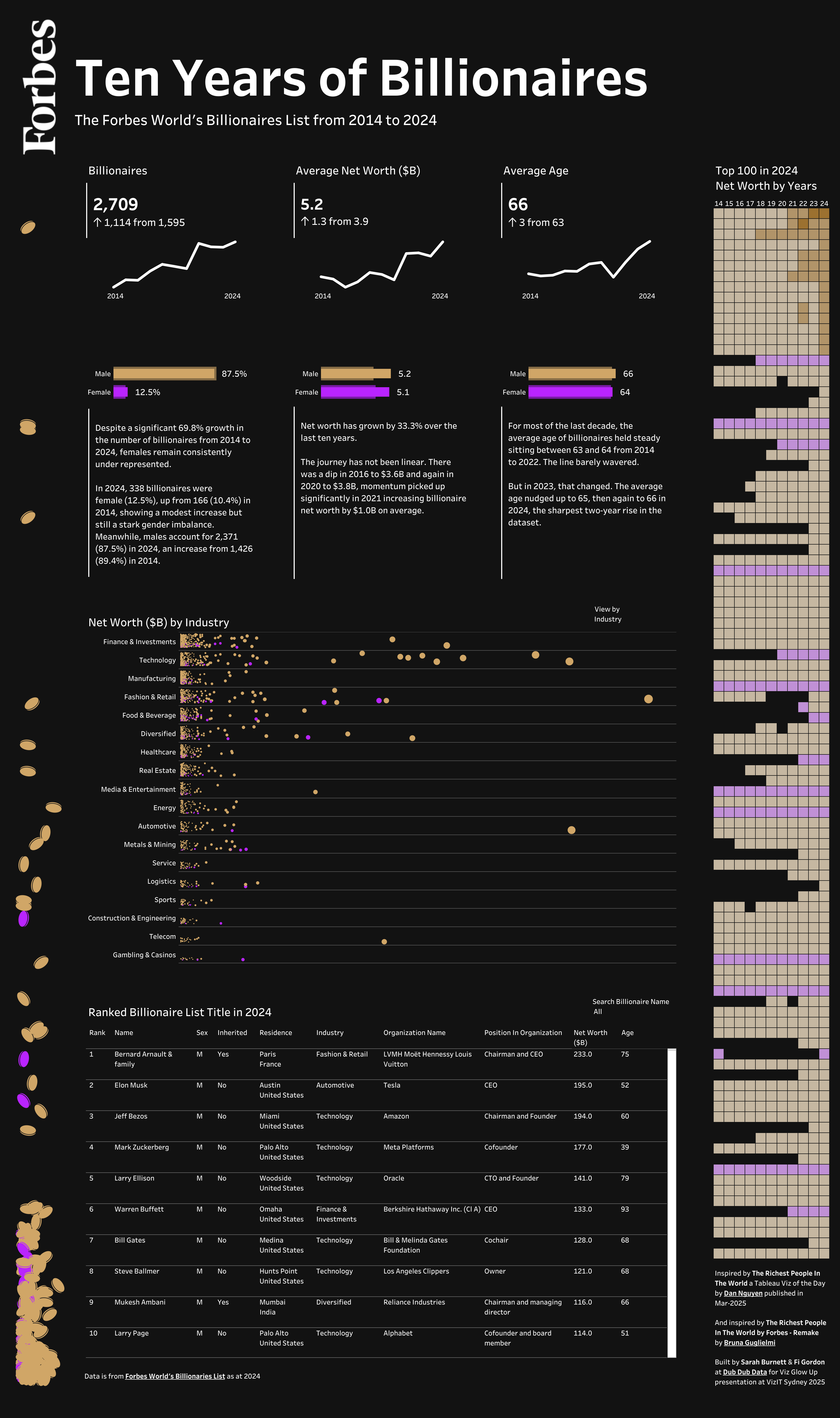
The Glow Up: From Data to Story
Here's where things got interesting. Instead of just fixing the issues, we decided to reimagine what this visualisation could be. The result? Something that feels less like a traditional dashboard and more like... well, Fi called it
"a fun infographic with a touch of quiet luxury."
You can view a copy of the Dub Dub Data Viz Glow Up, on Tableau Public
What Changed on the Tableau Dashboard (And Why It Matters)
- Time Became the Hero
The original showed a snapshot. Our glow up brings in 10 years of historical data (2014-2024) with sparklines that immediately show you the story: billionaires aren't just getting richer, they're multiplying. Fast. - The Gender Story Got Real
We kept Dan's gender breakdown but made it impossible to ignore. 87.5% of billionaires are men - and that number jumps out at you now instead of hiding in a filter. - Accessibility First (Not As An Afterthought)
This is where 2025 Sarah gets passionate. Nothing smaller than 10pt font. Ever. High contrast color combinations that work for everyone, even with dark mode, not just people with perfect vision. Clear labeling that doesn't make users guess what they're looking at.
In 2015, accessibility was a "nice to have." at best, likely not a twinkle in a developers eye. In 2025, it's even law in some countries. Our glow up meets WCAG standards because your insights should be available to everyone in your organisation.
- Colour Psychology That Actually Works
We kept the gold theme (because billionaires and gold just make sense), but our colour choices aren't just pretty - they're functional. The consistent gold for male, highlight purple for female creates an immediate visual distinction without relying on problematic colour assumptions. Every colour choice serves the story, not just the aesthetic. This one's our favorite. Instead of static circles, we created an animated "coin drop" effect that Fi described as "make it rain" - because sometimes data visualisation can be both informative AND fun. - The "Coin Drop" Visual
This flourish is a favorite for our infographic. In business dashboards we avoid adding additional ink on the page, but in our fun delivery we want a way to draw the eye down and add salt-bae visual seasoning. Instead of a static image or sketch for interest, we created an interactive "coin drop" effect that Fi described as "make it rain Vegas style" - because sometimes data visualisation can be both informative AND fun. Important to note it also has a visual boundary, with the vertical heatmap on the right hand side creating balance and framing the bulk of the story, or charts, in the middle. - Tooltips That Actually Tell Stories
Here's where we really leaned into modern UX principles. Every tooltip follows a consistent narrative structure - not just data dumps, but complete sentences that tell you who someone is, what they do, and why they matter. Take Bernard Arnault: "is a 75 year old male in the Fashion & Retail industry, based in France with a net worth of $233.0B in 2024." It's a mini biography, not a spreadsheet cell. Plus, we added interactive elements like "click to highlight" directly in the tooltip, making the exploration feel seamless rather than clunky. - Location Intelligence
The wealth concentration above the equator isn't just visible now - it's obvious. America and Europe dominate, and the heat map makes it clear where the real money lives.
- Avoiding Chart Overload
We felt Dan’s original viz showed some interesting insights with the Age Scatter plot, but we were also interested in our Industry insight (that the most billionaires have their wealth from the Financial and Investment industry), not to mention the map -where we discovered the wealth concentration.
Our challenge was making this available but not dragging on for two long!
One of the easiest ways to overwhelm your audience is to show everything all at once. Just because Tableau can fit ten charts on a screen doesn’t mean it should. That’s where Dynamic Zone Visibility comes in - it lets you toggle views on and off based on a selection, keeping the dashboard clean and focused. It means your user sees what they need in the moment, without the cognitive load of filtering through noise.
The Numbers That Made Us Stop and Stare
During our Viz Glow Up, a few insights hit us like a truck:
- Between 2020 and 2021, the average billionaire gained one billion dollars. Read that again.
- The dips in 2014-2016 and 2020 tell stories about market volatility that the original viz completely missed
- The Louis Vuitton family sits at the top of the wealth pyramid, but finance and investment have the highest number of individuals
What We Learned About Glow Ups (And Industry Evolution)
This wasn't just about making something prettier (though the gold and purple color scheme does look pretty slick). It was about showcasing how much our entire industry has matured in the last decade.
In 2015, Dan was pushing boundaries with sentence-structured tooltips and clean layouts. In 2025, those aren't innovations - they're expectations. The bar has moved, and that's a beautiful thing.
But here's what hasn't changed: the fundamental question remains the same. "What story is this data trying to tell, and how can we help it tell that story better?"
Dan's 2015 answer was revolutionary for its time. Our 2025 answer builds on that foundation with a decade of learned best practices, evolved tools, and matured design standards.
The original visualisation was functional. >> Our glow up is experiential.
The original answered questions. >> Our glow up makes you ask new ones.
The original presented data. >> Our glow up creates understanding.
What's Next?
We're buzzing about this project. Not just because we're proud of the work (though we absolutely are), but because this project represents something bigger.
It represents what happens when you stop accepting "functional" as the goal and start pushing for "transformational" instead.
Your dashboards don't have to be boring. Your stakeholders don't have to squint at tiny text or guess what your visualisations mean. And your data definitely doesn't have to hide its most interesting stories behind poor design choices.
The Bottom Line
Every visualisation in your organisation is a candidate for a glow up. The question isn't whether they're working - it's whether they're working as hard as they could be.
Start with one. Pick something that's functional but forgettable. Ask the hard questions. Make the improvements that matter, because the difference between good and gold? It's usually just one thoughtful iteration away.
Want to see the transformation for yourself? Check out Dan's original visualisation and our Forbes Billionaires Glow Up. The difference speaks for itself.
Want to learn more about Dub Dub Data viz glow ups? We specialise in transforming underperforming dashboards into high-impact data visualisations that build trust, enhance decision-making, and increase user adoption.
Reach out - let's make your data shine.
Stay connected with news and updates!
Join our mailing list to receive the latest news and updates from our team.
Don't worry, your information will not be shared.
We hate SPAM. We will never sell your information, for any reason.
