Why Dashboard Projects Fail - Fix Your Dashboard Design | Dub Dub
Apr 13, 2026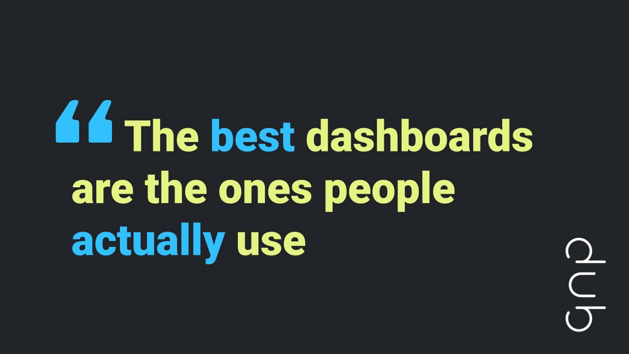
by Sarah Burnett & Fiona Crocker | Co-Founders, Dub Dub Data
Here is a number worth sitting with: 71%.
That is the proportion of professionals surveyed across a combined professional network who said yes when asked whether most dashboard projects fail. No definition of “failure” was provided - people were left to judge for themselves. And the majority verdict was a resounding yes.
That is a confronting figure for anyone who builds dashboards, manages analytics teams, or champions data strategy in their organisation. Books, courses, certifications, frameworks - we have had them for years. And yet, nearly three-quarters of dashboards apparently still miss the mark.
So what is going wrong? And more importantly, what does it take to build dashboards that actually drive action and decisions?
We explored this exact question in our latest unDUBBED podcast episode with Amanda Makulec and Andy Cotgreave - two respected voices in data communication.
👀 Prefer to watch instead?
We’ve dedicated an entire episode of our unDUBBED podcast to Dashboards Don’t Drive Decisions. People Do. Skip the scroll and view here.
Why Dashboards Fail: What Dashboard Failure Really Means
The 71% figure raises an immediate question: what does “failure” actually mean?
Many dashboards at the enterprise level sit on servers - technically deployed, technically part of the BI landscape. But if hardly anyone opens them, if the decisions being made in the business have no real connection to the key metrics they contain, are they working? Dashboards often fail not because they are poorly built, but because they were built for the wrong thing.
Broaden the definition a little - to any visual display of information designed to monitor conditions or support understanding - and the category expands considerably. People build analytics tools for themselves all the time, because the need for information never goes away. The question is whether the things we build actually serve real business needs, or just look that way.
Dashboard failure, in this framing, is not primarily a technical problem. It is a data adoption problem - one that begins long before a single chart is built, and one that no amount of dashboard design can fix after the fact. Stop expecting dashboards to drive business impact without first doing the work that determines whether anyone will use them.
The Root Cause: Why Dashboards Fail to Drive Action
The single most common reason dashboard projects fail is deceptively simple: teams start building before they understand what users actually need.
It sounds obvious. It is obvious. And it keeps happening anyway.
One story shared in the episode captures it perfectly: a practitioner at a university who read all the right books, knew the tool inside and out, went away for two months, and came back with a polished, technically excellent product. No pie charts. Beautiful bar charts. Twenty-five thoughtfully designed filters. The users hated it.
The realisation that came years later was equally straightforward: they had not paid attention to what users actually needed. They had been so focused on building a dashboard they were proud of that they had skipped the most important part - asking what specific decision this dashboard was meant to support.
This is the core failure mode in dashboard design. Not bad charts. Not the wrong tool. Not a lack of technical skill. It is not thinking deeply enough about real business needs, and not getting users involved early enough to ensure they will actually adopt and engage with what gets built.
Dashboard Discovery and Prototyping: The Framework That Gets Results
The dashboard design process that prevents this pattern is based on the Design Council’s Double Diamond model. In the discovery phase, you expand outward - gathering user inputs and perspectives - before narrowing down to define the real problem. Then you widen again, testing approaches with real users via prototype, before narrowing once more into development.
Discovery first. Prototyping second. Development third.
That order matters enormously. And critically, success criteria need to be defined before a single line of development begins - not afterwards, not once the dashboard is live and someone asks whether it is working. Before.
Did anyone define what success would look like for this dashboard before building it? That one question, asked early, changes everything about whether your dashboard drives the business impact it was built for.
Good Dashboard Design: Build for Users, Not Job Titles
Another reason dashboard projects fail is designing around job titles rather than actual people.
It is an easy trap. The brief arrives: build a dashboard for the finance team, the regional managers, or the marketing leads. So you design dashboards for those roles. You think about their functional requirements - what analytics they need access to, what KPIs matter to their team.
But good dashboard design requires going further. When you design dashboards with only the job title in mind, you leave out how that person actually engages with data - their graphicacy, their comfort with visualisation, where they go for information, what devices they use, how much time they have, and what key metrics they can realistically act on. Always design with the end user in mind, not just their title.
Understanding the business users who rely on your dashboards - their habits, their context, their relationship with analytics - is a completely different exercise from understanding their role. And it is the one that most determines whether a dashboard gets used.
Fix Your Dashboard Adoption: Why Reducing Friction Drives Action
If there is one concept that deserves to be written on the wall of every analytics team, it is this: reducing friction is one of the highest-leverage moves available to you.
The examples are hard to forget.
A government department in the UK was on a positive trajectory - growing server usage, building more actionable, data-driven dashboards. Then the IT department added two-factor authentication. Views fell off a cliff. Not because the dashboards got worse. Not because people stopped needing the metrics. Because one extra step was too much friction. This is one of the most common reasons dashboards fail to achieve the adoption that teams work hard to earn.
On the other end of the spectrum, a US emergency counselling organisation built a dashboard that was nothing but text characters served through a messaging platform - no graphics, no BI tools, no visualisation licence required. Just key metrics, available on demand, without anyone leaving their workflow. Dashboards that people actually use are almost always the ones with the least friction between the user and the information.
And then there is Wordle - the viral word game that spread globally. Part of its success came from something small: the ability to copy and paste results directly into a messaging app. Dashboards only work when the barrier to access is lower than the value of the information. The closer you get your metrics to people, in the reporting tools and formats they already use, the stronger your adoption will be.
The principle is the same across every example: data where people want it, in a format they can respond to quickly, without disrupting their workflow. The bar for what counts as too much friction is lower than most analytics teams realise.
Story Finding vs Storytelling: Why Actionable Analytics Decisions Fail
One of the most practically useful distinctions in the episode is the difference between story finding and data storytelling - and the real cost of conflating the two.
Story finding is the exploratory, analytical process. Dashboards are the primary tool here. You are digging into the data, surfacing patterns, and understanding what the metrics are actually saying. It requires detail, depth, and a tolerance for ambiguity. The audience is typically the analyst or a small team working through a problem together.
Data storytelling is what comes next. It is the process of taking that understanding and translating it into something a broader audience can act on, in the time they have available. The analytics approach is completely different. The level of detail is different. The assumptions you can make about your audience are different.
It is also worth remembering that data communication is broader than visualization. Sometimes a single metric, delivered at exactly the right moment to the right person, is worth more than an entire interactive dashboard. Knowing which mode you are in - and structuring your work accordingly - is one of the most important judgements a data practitioner can make.
This distinction was first articulated in a Nightingale article published through the Data Visualisation Society, and it is one worth returning to regularly.
AI, Data and Business Impact: Why Trust Cannot Be an Afterthought
Dashboards don’t fail only at the build stage - they fail at the trust stage too. Pretty data that turns out to be wrong destroys credibility faster than almost anything else in an organisation. Years of careful relationship-building can be undone in a single meeting.
Dashboards aren’t the problem when this happens - governance is. AI tools are very good at producing outputs that sound confident and coherent, regardless of their accuracy. Definitional differences - “conversion rate” means different things to different teams, for example - mean it is entirely possible to produce beautifully structured data that is functionally wrong. When that happens in a board meeting, it is not just the dashboard that loses credibility. It is the entire analytics function and the data strategy behind it.
Building confidence requires clear ownership of what the metrics mean and how they are calculated. Consult with stakeholders directly when errors occur. When you say you will do something, do it. When something goes wrong, own it clearly and explain what will prevent recurrence. Having that rapport in place means business leaders will make decisions alongside you, rather than quietly losing faith in the data altogether.
Many successful analytics professionals brought backgrounds in service industries to the field. Those interpersonal skills - building rapport, following through on commitments, being someone people feel they can rely on - are foundational to whether data work actually drives real business outcomes. If your team needs support building those skills alongside their technical capabilities, read more about how to build confident data analysts.
What the Best BI Dashboards Have in Common: Key Metrics and Tools
When asked about the effective dashboards they had personally seen, the examples shared were a weather app and the NASA Earth Information Centre. Neither of these are traditional business intelligence tools. Both are clear, purposeful, and built entirely around what users actually need to do with the information.
The best dashboards - the ones that deliver genuine business impact - share a few qualities. They define business goals upfront, they surface only the metrics that matter, and they are built for the people who will use them, not the people who built them. Dashboards that deliver, in the truest sense, are the ones designed with business objectives at the centre and end users in mind throughout.
A few quick-fire observations from the episode are also worth noting. Pie charts were defended, not abolished - a useful reminder that no chart type is inherently wrong, only wrongly used. The prediction for dashboards in ten years: fewer, but better. The ones that survive will be genuinely good dashboards with clear business purpose. And when it came to choosing between a human-curated story and an AI-generated insight, the answer was immediate and unanimous: the human every time.
Conclusion
The 71% figure is not a verdict on dashboards as a concept. Dashboards aren’t the problem - the way most of them get built is. The reasons dashboards fail are consistent: skip discovery, design for a job title instead of a person, add too much friction, and conflate story finding with data storytelling. None of those problems require better software to solve. They require better questions, asked earlier, of the right people.
The dashboards that work are not the most sophisticated ones. They are the ones built by data teams across Australia and New Zealand who understood what users actually needed, designed with the end user in mind, aligned their analytics work with real business objectives, and earned enough credibility to stay relevant. That is as achievable as it has ever been - it just requires doing the work in the right order.
Frequently Asked Questions
-
Why do most dashboard projects fail to drive decisions?
The most common cause is that development begins before anyone has defined what specific decision the dashboard is meant to support. Without that clarity, dashboards become monitoring tools that track metrics but never influence behaviour. Discovery and prototyping with real users must come before development, not after.
-
What is the double diamond model, and how does it apply to dashboard design?
The double diamond is a design framework from the Design Council that structures the creative process into four phases: discover, define, develop, and deliver. For the dashboard design process, this means expanding outward in discovery to gather user input and define the real problem, then expanding again in prototyping to test approaches with real users, before narrowing into development. Most analytics teams skip the first two phases entirely.
-
How do you fix your dashboard adoption by reducing friction?
Start by looking at every step between the user and the key metrics they need. Single sign-on instead of separate logins, embedding analytics in BI tools people already use, mobile-friendly formats, and simplified outputs that answer one question clearly - all of these reduce friction. The goal is data in the right place, in the right format, without requiring people to leave their workflow.
-
What is the difference between story finding and data storytelling?
Story finding is the exploratory, analytical process of understanding what the metrics are telling you - it requires dashboards, detail, and depth. Data storytelling is the process of communicating that understanding in a way an audience can act on, within the time they have. They require different tools, different analytics approaches, and different assumptions about your audience. Treating them as the same thing is one of the most common mistakes in data communication.
-
How do you build trust in data and dashboards with business leaders?
Trust is built through consistent follow-through - doing what you say you will do, every time. When errors happen, consult with stakeholders directly, own them clearly, and explain what will prevent recurrence. Investing in relationships with business leaders who use your data, understanding their KPIs and context, and designing for their actual needs all contribute to lasting credibility. Business intelligence only delivers real business impact when the people it serves believe in it.
Ready to Build Actionable Dashboards That Drive Decisions?
Book a free 30-minute discovery call with the Dub Dub Data team and we will help you work out where the biggest opportunities are in your data right now.
Watch Dashboards Don’t Drive Decisions. People Do. Podcast
Follow us on your favourite platform:
🎙️ Unscripted. Uncensored. Undeniably data.
🎙️ D36: Dashboards Don’t Drive Decisions. People Do.
In this episode of unDUBBED, hosts Sarah Burnett and Fiona Crocker sit down with Amanda Makulec and Andy Cotgreave - two of the most respected voices in data communication - to tackle one of the industry’s most uncomfortable questions: do dashboards actually work?
Amanda Makulec is a data visualisation leader with 15 years of experience helping teams communicate data effectively. She is a founding board member and former executive director of the Data Visualisation Society. Andy Cotgreave spent 20 years in data and analytics, 15 of them at Tableau, before co-founding How to Speak Data. Together they co-host Chart Chat and are co-authors of both the Big Book of Dashboards and Dashboards That Deliver.
The conversation covers why most dashboards fail before anyone opens a tool, how story finding and data storytelling require completely different design approaches, and why reducing friction is often more powerful than adding features. They also get into the messy, exhilarating, and frankly terrifying reality of AI’s impact on data teams.
Takeaways
- 71% of people surveyed said most dashboards fail - but did you ever define what success looked like in the first place?
- The most common mistake is diving into building before understanding what users actually need - discovery and prototyping must come before development.
- Dashboards don’t drive decisions, people do - the real value of data happens in the conversations it sparks, not the charts themselves.
- Reducing friction is one of the highest-leverage moves you can make - data needs to meet people where they already work.
- Story finding and storytelling are completely different design paradigms - conflating them is one of the most costly mistakes in data communication.
- Pretty data that turns out to be wrong destroys trust faster than almost anything - and AI makes this risk higher, not lower.
- Your data team is probably using AI extensively without telling you - and leadership’s early bans are almost certainly why.
- The word “dashboard” is just semantic drift from stagecoaches - what matters is whether people can act on the information, whatever you call it.
- Data communication is broader than data visualisation - sometimes one metric at the right moment beats an entire interactive dashboard.
- In an AI-obsessed world, the things that remain irreplaceable are human context, earned trust, and genuine connection with the people who use your data.
Chapters
00:00 Introduction to Dashboards and Their Value
08:35 The Failure of Dashboards: Insights and Statistics
19:23 Redefining Dashboards: Integration and User Experience
21:54 Teaching Data Visualization Workshops
24:02 The Future of Dashboards
33:38 Data Communication vs. Data Visualization
44:26 AI and the Role of Data Teams
45:10 The Rapid Evolution of AI Technology
47:04 Balancing Productivity and Ethical Concerns in AI
47:51 The Importance of Human Connection in Data Analysis
50:04 Building Trust and Communication in Data Work
53:12 Quick Fire Round: Insights and Opinions
56:11 Key Takeaways and Final Thoughts
Links
Viz Responsibly (Amanda’s Substack)
Iraq’s Bloody Toll by Simon Scarr
Weapons of Math Destruction by Cathy O’Neil
Keywords
amanda makulec, andy cotgreave, dashboards that deliver, big book of dashboards, why dashboards fail, dashboard design, data communication, data visualisation, story finding vs storytelling, AI and data analytics, future of dashboards, dashboard strategy, user centred design, discovery before development, reducing data friction, data trust, data decision making, how to speak data, chart chat, data visualisation society, datafam, unDUBBED, dub dub data, dashboard best practices, data storytelling
TL;DR
Dashboards don’t drive decisions - people do. Amanda Makulec and Andy Cotgreave join unDUBBED to unpack why most dashboards fail, what to do about it, and why the human element remains irreplaceable even in an AI-obsessed world.
Stay connected with news and updates!
Join our mailing list to receive the latest news and updates from our team.
Don't worry, your information will not be shared.
We hate SPAM. We will never sell your information, for any reason.
