Exploring Social Media Performance in a Tableau Dashboard - Real World Fake Data
Sep 25, 2025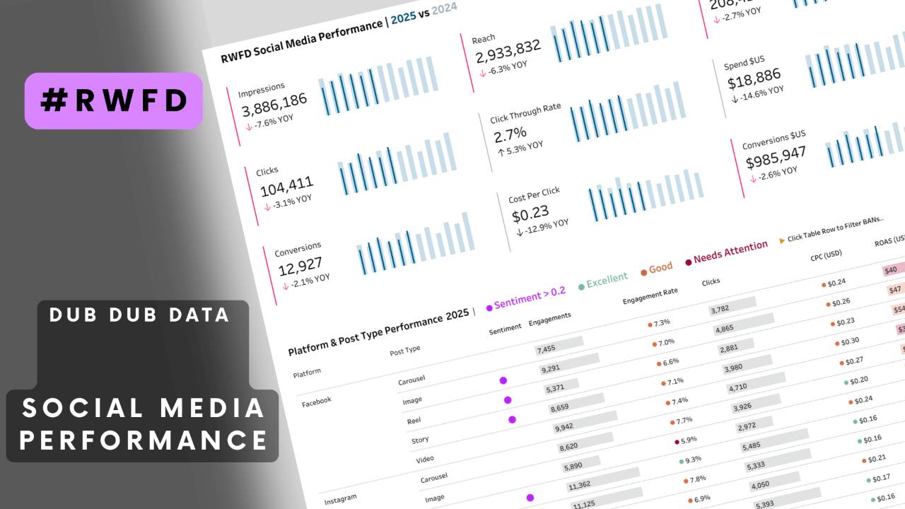
by Fiona Crocker | Co-Founder, Dub Dub Data
TL;DR
In the first month of Season 4 Real World Fake Data (RWFD), I built a social media analytics dashboard in Tableau designed for marketing managers and analysts. It’s an exploratory Tableau dashboard, interactive and focused on the top metrics that drive campaign success – impressions and clicks, conversions, engagement, CPC, and ROAS. Using thoughtful colour, dynamic filters, and year-on-year trend comparisons, the dashboard makes it easy for social media managers to track performance across platforms like Instagram, Facebook, LinkedIn, TikTok, and Twitter/X.
Explore my viz on Tableau Public or build your own and download the RWFD dataset.
What Is Real World Fake Data?
RWFD is a Tableau Community project where members design BI dashboards using Tableau to create realistic but fabricated datasets. The idea is simple: business dashboards are rarely shared publicly because the underlying data is sensitive. RWFD solves this by providing strategically fabricated or synthetic data sources that mimic real industries like finance, HR, and now digital media and social media marketing. It's a great way to test your design skills and feature dashboard examples for business work in your design portfolio on Tableau Public.
August’s dataset was designed for social media performance reporting, making it a perfect playground for marketers, analysts, and consultants who want actionable insights from social media campaigns across multiple social media platforms.
How I Designed My Tableau Marketing Dashboard
This dashboard started with a clear idea, but like most design projects, it evolved along the way. I explored several different visualisations and even uncovered some extra insights, but including everything threw off the balance of the overall design. In the end, I made deliberate choices about what to leave out so the story stayed focused and coherent.
After I had pulled the design together, Sarah gave me thoughtful feedback that helped me refine the final version and sharpen the message. It’s always a learning process, and I’m excited to share the result as part of the Real World Fake Data challenge.

Click here to view live dashboard
What Was My Data Analysis Goal?
Instead of telling a single story, my intent was to create an exploratory marketing dashboard that empowers social media managers optimise and make informed decisions, with:
- Visiblity into Platform, Post Type, Content Theme, Campaign Name and Target Audience performance.
- An ability to spot underperforming social media campaigns instantly, providing a detailed overview that helps you gain actionable insights into what works.
- Year-on-Year Trends: this kind of dashboard also shows how real-time data comparisons can highlight shifts in social media engagement and conversion rates across campaigns
What Marketing Analytics KPIs & Metrics Were Included?
The performance dashboard focuses on the core key performance indicators of digital marketing campaigns:
- Impressions
- Reach
- Engagements
- Clicks
- Click-Through Rate (CTR)
- Spend in USD
- Conversions & Conversion Value
- Cost per Click (CPC)
- Return on Ad Spend (ROAS)
What Makes My Data Visualisation Interactive?
- Dynamic Table View: Users can use parameters with dimensions, e.g. select platform + post type and instantly see how KPIs perform.
- Clickable Rows: Clicking a table row updates performance filters BANs at the top, providing a YOY trend.
- Multi-Select Filters: Apply buttons and a tidy pop-out filter bar keep the design clean.
- Elegant tooltips: this dashboard provides clear Year-on-Year statistics for the month (BAN tooltip), with clean colours that draw attention
Why Colour and Layout Matter in the Best Tableau Dashboards
Thoughtful colour is crucial in all data visualisation best practices. In my dashboard:
- Dub Dub Data’s Colour Palette keeps the design professional, on-brand, and easy to interpret, showing how a dashboard helps marketing teams visualising data effectively.
- Subtle Alerts: Hot pink Gantt bars next to on BANs (big as* numbers) highlight when last year outperformed the current period, drawing immediate attention.
- Year-on-Year Trends: Bar-in-bar chart with darker blue bars represent 2025 vs paler blue pushing information into the background for 2024, drawing the eye to current results.
- Borderless Grouping: Use padding to add white space between BANs and table, so proximity cues drive grouping and focus, eliminating the need for enclosure.
Making the RAG Palette Accessible for Colour-Blind Users
One of the design decisions I always take seriously is colour accessibility. Around 8% of men and 0.5% of women live with some form of colour vision deficiency, so relying on red–green signals alone can make dashboards harder to use.
For this dashboard, I tested my RAG (Red–Amber–Green) palette with the Coblis Color Blindness Simulator. By running the viz through simulations of Protanopia (red-blind), Deuteranopia (green-blind), and Tritanopia (blue-blind), I was able to confirm that the palette holds up:
-
Hue + Shape + Context: Colours aren’t the only indicator. Each category (Excellent, Good, Needs Attention, Sentiment >0.2) also has a symbol or text label, meaning users can distinguish results even if the hue differences blur.
-
Contrast in Lightness: The shades I chose differ not just in hue, but also in lightness/darkness, which makes them distinguishable in grayscale or monochromatic views.
-
Consistent Legends: Labels and clear legends explain what each colour means, so even users with partial vision deficiency won’t need to guess.
Here’s what the simulation shows (see GIF slowly changing in the pink highlight box):
-
Under normal vision, red, amber, and green appear as expected.
-
With vision deficiencies the palette shifts in tone but the differences in saturation and brightness still separate the categories

Example Insights from the Dataset
Image above demonstrates dashboard action filtering Instagram + Image row

Even though RWFD uses fabricated data, it surfaces insights similar to what real managers might find:
- Instagram Image Posts showed poor ROI: high CPC, low engagement, and low ROAS.
- Clicking on this row, then filters the BANS with Year-on-Year comparisons flagged declines across engagements, clicks, CTR, and conversions, suggesting underperformance vs the prior year.
For a social media manager or digital strategist, these insights would trigger a rethink of creative formats, social media strategies, platform mix, and audience targeting.
Why Real World Fake Data Is Valuable
RWFD is more than just fun - it’s a learning and consulting showcase. For me, it was a chance to:
- Demonstrate interactive Tableau design techniques for clients.
- Sharpen skills in social media analytics dashboard design.
- Share a portfolio-ready visualisation that blends storytelling with flexibility.
- Simplify complex data with engagement metrics across a broad range of campaigns
This is also a safe way for consultants and marketing teams to practice building dashboard templates on realistic raw data without exposing sensitive information.
Explore and Try It Yourself
Real World Fake Data offers the perfect chance to sharpen your business design skills and explore new techniques. A huge thank you to Mark Bradbourne for curating the synthetic dataset and giving the community this fantastic opportunity to learn.
Finished your Real World Fake Data dashboard? Don’t forget to publish it on Tableau Public and show it off on LinkedIn with #RWFD!
I’d love your feedback - what insights stand out to you? How would you design it differently? Share your thoughts or build your own version!
Need Help with Social Media Performance KPIs & Analytics?
At Dub Dub Data, we help businesses in Australia, New Zealand and beyond design beautiful, business-ready performance dashboards in Tableau customised to meet your marketing strategies. Whether you need social media reporting, marketing performance tracking, or enterprise data strategy, our consulting team can help.
👉 Contact us today to explore how we can turn your data into decisions.
Stay connected with news and updates!
Join our mailing list to receive the latest news and updates from our team.
Don't worry, your information will not be shared.
We hate SPAM. We will never sell your information, for any reason.
