Best Way to Learn Tableau? My Next Level Tableau Course Review for Data Visualisation & BI
Jan 29, 2026
by Fiona Crocker | Co-Founder, Dub Dub Data
TL;DR - Next Level Tableau Review for Analysts (Tableau Course Takeaways)
Next Level Tableau works because it doesn’t just teach what to do - it teaches how to think in Tableau. After more thanten years of using Tableau, I still learnt dozens of techniques from this Tableau course. LODs are framed as decisions about granularity, not syntax tricks. Dates become reusable frameworks rather than one-off hacks. Map layers turn into a layout engine. Order of operations becomes a debugging tool you can actually use.
Plus there are micro-habits that save time in Tableau Desktop: right-click date dragging, label toggles, alignment discipline, and map layer control. The culture is unusually good too - people genuinely build along, questions get asked, and mistakes are normalised. That’s rare in technical Tableau training, and it changes what people retain.
The Difference Between Learning Tableau and Thinking in Tableau
There’s a certain type of Tableau training that looks impressive on paper and achieves very little in practice.
You know the kind.
People attend. Notes get taken. A few visualization tricks get shared. Then everyone goes back to work and keeps building dashboards the same way they did before - just with slightly more vocabulary.
When people ask us where to learn Tableau “properly”, they’re usually asking for something else. They want training that changes how someone thinks in Tableau Desktop - how they approach logic, how they debug, how they build quickly without creating a mess they’ll regret later. That’s the difference between completing online courses and actually gaining usable Tableau skills.
At Dub Dub Data, when we recommend an external program, we’re deliberate. We don’t outsource learning lightly, and we put our own team through the things we recommend - because skills in Tableau show up in the work: fewer breakages, clearer definitions, and better outcomes for stakeholders.
One of the few programs we consistently send people to is Next Level Tableau, led by Andy Kriebel. That includes clients, community members, and our own team.
This post is the practitioner version. It’s not a sales pitch. We don’t earn anything from Next Level Tableau - we just love people learning from the best. No matter where you’re at in your Tableau career, you’ll pick up tips and techniques you can use immediately. To help you decide if NLT belongs on your learning path, I reviewed a cross-section of sessions from beginner to advanced:
- LOD calculations (beginner - foundational thinking that scales)
- Dates (intermediate - capability building that reduces fragility)
- Gauge charts via map layers (advanced techniques - stretch thinking that changes your mental model)
Along the way, there were also a bunch of small, boring, time-saving behaviours that compound fast - the kind that experienced Tableau users love because they shave minutes off repetitive work.
The Setup: It’s Interactive Tableau Learning...
... Even When You’re Watching Recordings
We’re based in APAC, which means we often miss the live sessions. That’s usually a dealbreaker for anything that claims to be hands-on.
It wasn’t here.
Even watching recordings, the sessions still feel like live training because the structure is built around interaction. Andy responds to people as they build. People ask questions mid-process. Someone inevitably takes a wrong turn, and Andy calmly rewinds, re-explains, and keeps the room moving without shaming anyone. It’s structured learning in the best way - practical, supportive, and focused on capability.
That “build with me” rhythm does two things that most Tableau learning doesn’t:
- It forces the learning into your hands, not your notes.
- It exposes the mistakes that everyone makes, but no one admits to.
This matters because memorising steps rarely solves Tableau problems. Tableau work is solved by building a mental model, hitting a weird result, and knowing where to look. It’s how you use Tableau when the data or the chart fights back.
There’s also a subtle cultural mechanism at play. Cameras-on. There were 19 people on one call, 22 on another. No one knows who might be called on. Andy is supportive and generous with encouragement, and the group energy stays high because participation is normal.
The surprising part: plenty of people on the call were the kind of practitioners you’d expect to “already know everything” - strong portfolios, strong taste, confident builds. They were there to learn too. That’s usually a good sign.
Besides the videos, there’s a community where you can chat with members, ask for help, and troubleshoot with peers. There’s also downloadable content that even experienced Tableau Desktop developers will love - especially if you’re building at scale and want fewer fragile patterns.
In addition to the classes, the subscription includes access to the member community and a bunch of tools that help you get further, faster. If you’ve ever had to publish your Tableau platform, maintain dashboards, and support a team’s workflow, you’ll appreciate the emphasis on sustainable practices - not just flashy builds.
The Tiny BI Dashboard Technical Wins (that you immediately start using)
Before we get into the big topics, it’s worth calling out the small wins, because they were constant. Spending time on Next Level Tableau pays dividends because I’m faster at work and less frustrated - the kind of improvement every data analyst and analytics professional appreciates.
Five quick wins from this review:
1) Right-click drag dates for fast discrete/continuous in Tableau Desktop
Dragging a date pill with the right mouse button and selecting Discrete. A quick change that drops five clicks to three. Tiny, but it adds up when you’re building interactive dashboards all week.
2) The “T” button in the toolbar adds labels
Yes, that T. Once you notice it, you’ll wonder how you missed it. It’s a micro-efficiency that speeds up iteration when you’re testing layouts, label density, and readability.
3) Order of operations reference guides that are actually useful
Order of operations is one of those topics everyone vaguely remembers. But when you need it mid-debug, it’s usually painful to locate and interpret quickly.
Having quick reference material reinforced in context makes it usable. It becomes a tool you reach for when something behaves strangely - especially when calculated fields and filters collide.
4) Right align your numbers so commas line up
This is a best practice everyone agrees with, but doesn’t consistently do until it’s drilled in.
Right-aligning numbers makes it easy to compare relative size at a glance. It’s a small data visualization habit, but it materially improves dashboard readability and reduces cognitive load.
5) Clear Sheet (next to Switch Rows/Columns)
Somehow missed it for years.
It’s one of those buttons you don’t notice until someone points it out, and then you use it constantly. It keeps your flow clean when you’re iterating through drag-and-drop builds and trying ideas fast.
There were plenty of other micro-wins too - each one shaving off time. One less click here, two fewer clicks there. It all adds up to less time at your desk formatting and more time doing real analysis.
Topic 1: LOD calculations - beginner thinking that scales
LOD calcs are one of the most reliable sources of Tableau pain.
Beginners get overwhelmed because the syntax feels abstract. Experienced practitioners can have the opposite problem: they learnt LODs piecemeal, picked up “folk patterns”, and now have inconsistent mental models layered over years of work.
What Andy does well is treat LODs as a thinking tool.
Not:
- “Here are the three types.”
- “Here’s the syntax.”
But:
- What grain are you trying to answer the question at?
- What grain is the view at?
- What is Tableau doing when those don’t match?
That framing is what allows LODs to stop being magic and start being deliberate - and it upgrades your understanding of Tableau in a way that carries into every build.
Session 1A: Common language before cleverness
The first session focuses on clarity over impressiveness.
Andy re-anchors trainees’ understanding around:
- granularity
- decision points
- when to use them
- when not to
For teams, this matters because it creates alignment. People stop solving the same problem five different ways. The benefits aren’t theoretical - they show up in maintenance:
- fewer fragile calcs that only one person understands
- easier dashboard review
- more consistent metric definitions
- smoother handovers when someone else needs to extend the work
This is the difference between “I can make it work” and “we can build this as a team” - which is core to business intelligence work.
Session 1B: Applying the thinking in familiar patterns
The second session moves straight into application using real dashboard patterns, not contrived exercises. This is where the training feels genuinely real-world.
The builds were the kind of things you see constantly in internal reporting:
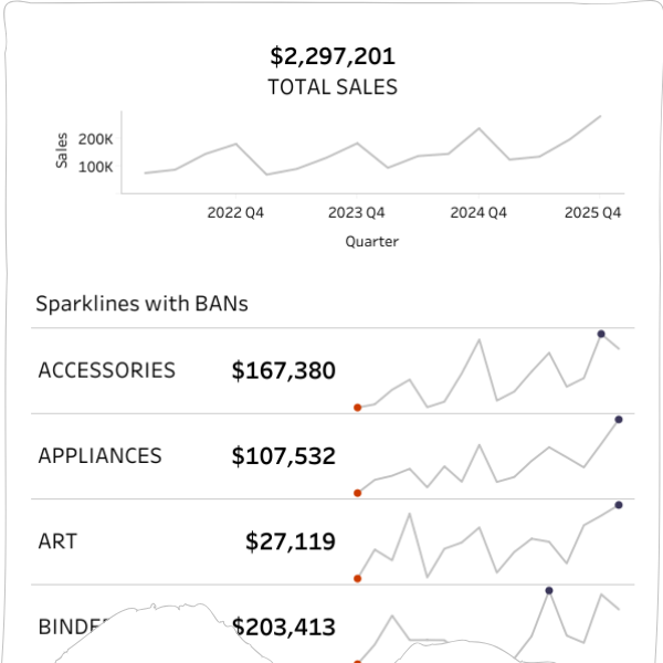
- a single-sheet KPI view (headline metric plus context)
- sparklines with reference bands (trend and performance at a glance)
These are deceptively simple. They’re also where LOD thinking either makes your dashboard stable or turns it into a brittle pile of exceptions.
What I liked is that LODs weren’t taught as “the advanced trick”. They were shown as a practical way to get control fast without creating downstream chaos - the kind of habit a Tableau Business Intelligence Analyst needs when stakeholders ask for “just one more filter” on a critical report.
The LOD build
You can check out the full dashboard here.
Topic 2: Dates - capability building that reduces fragility
Dates are always the hardest part of any tool.
It’s not because dates are complicated in concept. It’s because they have too many edges:
- week starts
- fiscal calendars
- date parts vs date values
- period-to-date definitions
- comparison logic
- timezones and time (if you’re unlucky)
A lot of Tableau dashboards break quietly because date logic is inconsistent. Worse: dashboards can be wrong without looking wrong. That’s the nightmare scenario in business analytics.
This session tackled that head-on by building reusable patterns instead of one-off hacks - which is a big deal if you’re trying to analyse data consistently across teams, data sources, and time windows.
What was built
The session focused on practical outcomes that show up in real reporting.
Key pieces included:
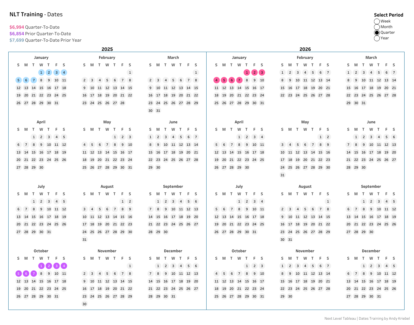
- A compact calendar-style view using map layers and MAKEPOINT - one of those “Tableau is weird and brilliant” moments. Map layers stop being maps and start being a layout engine. You get full control over spacing and placement.
- A single Period-to-Date framework (WTD/MTD/QTD/YTD) driven by one parameter, Boolean calculations, and logic to consistently highlight current period, prior period, and same period last year.
- Practical considerations teams constantly trip on: week-start handling, YoY comparisons, and formatting choices that improve readability and support better data visualisation principles.
None of this is revolutionary individually. The value is that it’s assembled into a framework you can reuse. That’s what reduces fragility when the data in Tableau changes, someone swaps a data source, or definitions evolve.
The part that matters: Andy explains why it works
Dates are a domain where people can copy a calc and still not understand it.
Andy’s coaching style is to spread calculations out, build them in steps, and narrate the reasoning. It’s excellent for learners because you’re not just memorising - you’re building a model you can adapt later. That matters when your stakeholder wants a different fiscal year, your team uses a different week start, or your organisation shifts how they measure performance.
Choose the pace that suits you
I watched parts at 2x speed - until there was something I didn’t know. Then it was straight back to normal speed.
That’s a decent measure of density. You can sprint through the basics of Tableau you already know, then slow down for the parts that are genuinely new.
A real debugging moment (and the modern workflow)
At one point, my output didn’t match Andy’s.
Same data. Same steps. Different result.
This is a normal Tableau experience. It’s also where many learners spiral because they assume they’ve “done it wrong” and stop - which is the fastest way to stall skill growth.
Instead, I did what most practitioners do now:
- quick GPT prompt (with messy spelling)
- screenshot of my Marks card
- iterate the question
The fix that came back was very specific:
- open Map Layers (stacked squares icon)
- turn off map backgrounds: Base, Coastlines, Land Cover, Terrain
- basically disable background layers Tableau was applying faintly
That removed the banding and brought the output back in line.
The combination of strong coaching plus modern troubleshooting is increasingly how Tableau work gets done - especially when you’re analysing complex data, transforming raw data into something useful, and trying to keep delivery moving.
The calendar build
You can check out the full dashboard here.
Topic 3: Gauge charts - visualisation techniques that challenge your mental model
This session was a while ago, and I came into it sceptical.
Every ounce of my data visualisation experience shouted no.
Gauge charts are:
- harder to read than most alternatives
- often imprecise
- frequently misused
Andy didn’t pretend otherwise. The point wasn’t “gauges are good”. The point was: can you break down a complex visual into controllable components and rebuild it deliberately?
That’s stretch learning - and it’s a fast track to stronger visualisation techniques.
The session structure: maths whiteboard and then straight into builds
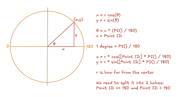
Andy opened with a quick maths whiteboard. Brief eye glaze. Then we built.
It was fast paced. Lots of calcs. Lots of map layers. The hour flew by while I tried to keep up.
Could I recreate the full build from memory afterwards? No. But I did walk away with patterns I can reuse:
- how geometry can be represented and controlled in Tableau
- how map layers can be repurposed as a layout engine
- how to avoid layered hack stacks by simplifying the approach
- how to create interactive elements cleanly, without turning the workbook into a fragile beast
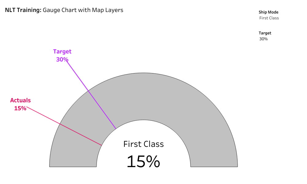
The technical core: single mark, geometry, parameters, map layers
The gauge build relied on:
- basic geometry
- calculated fields
- parameters to control behaviour
- careful layout and labelling
- map layers as the rendering surface
- a special sheet from Andy
One of the most useful things about this style of build is that it teaches you how Tableau renders marks and space. Once you get that, you stop being trapped by default chart types - and you start building interactive dashboards that are both visually appealing and technically sane.
Do you need to ship gauge charts? Probably not.
But the ability to deconstruct and rebuild visuals becomes valuable in every non-standard situation - especially when a stakeholder wants something “different” and you need to decide whether it’s worth doing, and how to do it cleanly if you proceed.
Learning through challenge: the target line was left to students
Andy left the target line for students to complete. That choice matters because it forces recall and ownership, rather than passive follow-along.
Again: not comfort learning. Capability learning.
The Production Polish: removing the OpenStreetMap notice
We didn’t cover this in class, but I hated the © OpenStreetMap notice in the corner.
It’s technically correct, but it doesn’t always land well with end users - especially in polished internal dashboards.
The fix:
- Map > Background Layers
- Washout to 100%
Small finishing detail. Immediately makes the output feel less like a prototype.
The gauge chart build
You can check out the full dashboard here.
Looking for the Best Tableau Course? You'll Learn the Best Business Intelligence Habits
If you’re reading this hoping for a list of “things to learn” you can find that anywhere.
The value in these sessions is the build habits that show up repeatedly:
- calculations built in steps, with reasoning
- consistent reference to order of operations
- deliberate attention to alignment and readability
- map layers treated as a flexible engine, not a niche feature
- debugging treated as normal, not failure
Andy’s coaching style makes it hard to hide.
If you’re building alongside, you hit the same friction points you hit at work: outputs don’t match, a mark behaves oddly, a parameter doesn’t do what you expected, a map layer adds something you didn’t ask for. And you watch how the diagnosis happens.
This is why the program feels more like an apprenticeship than a typical self-paced video library - even if you consume it in a self-paced way. It's fundamentally the best course to use Tableau.
What This Looks Like Back in your Data Visualisation Team
The test of training is what changes on Monday morning.
Here’s what we see change when people go through this kind of program:
People stop relying on folklore
Instead of “try a FIXED”, you see clearer reasoning around grain, view context, and why a metric should be defined one way not another. That’s what mature data analytics looks like.
Date logic becomes more standardised
Instead of “everyone has their own WTD”, you start seeing reusable frameworks. Dashboards feel more consistent and less risky - and your business intelligence reporting becomes more trustworthy.
People build faster because they waste fewer clicks
Right-click date dragging, label toggles, clear sheet, alignment discipline. It’s not one trick - it’s a hundred small reductions in friction that make dashboard creation faster and calmer.
Map layers become a serious tool
Not just for maps. For layout. For structure. For controlled positioning. Even when you’re building heat maps, non-standard layouts, or creative compositions, map layers become a reliable engine.
People get calmer about debugging
Because they’ve watched someone debug live without spiralling, and they’ve seen how order of operations and mark settings interact. It’s the difference between being data-driven in theory and being effective in practice.
Final thoughts (and yes, the bronze star)
We’ve repeatedly recommended Next Level Tableau to learn data visualisation skills because it consistently delivers capability uplift without relying on hype. If you’re comparing best Tableau courses and wondering what belongs on your shortlist for courses for 2026, this one earns its place because the course content is designed for people who actually build, maintain, and improve dashboards in the real world.
Tableau is a powerful data platform from Salesforce, and that’s exactly why training quality matters. When you work with raw data, messy data sources, and changing requirements, you need more than features - you need judgement, patterns, and repeatable methods to visualise data and share insights that are actionable.
If you’re a practitioner looking to level up your Tableau capability, Next Level Tableau consistently delivers. The value isn’t that you learn “skills for data and analytics” - it’s that your default approach becomes cleaner, faster, and more reliable, you master Tableau.
You’ll walk away with:
- clearer mental models that help data analysis and inform decisions
- reusable patterns you can trust across data manipulation and reporting
- better build mechanics that save time every day
- fewer brittle dashboards that need constant maintenance
And if you’re the kind of person who cares about small efficiency wins (you are, if you’re still reading), you’ll pick up a ridiculous number of time-savers along the way.
I’m still quietly hoping for one of Andy’s bronze stars for my review, even though it’s technically only for answering questions in his live classes.
Frequently Asked Questions - Next Level Tableau Review (NLT)
Is Next Level Tableau the best way to learn Tableau?
If you want more than “how to build charts”, yes. NLT is strong because it teaches how to think in Tableau-granularity, debugging, order of operations, and reusable frameworks-so you can solve unfamiliar problems without relying on copied formulas.
Who is Next Level Tableau for?
It suits:
- People who are starting out with Tableau – learn the most efficient and easy way that has provided successful for thousands of professionals
- Analysts and BI Developers who build dashboards weekly and want faster, cleaner builds
Intermediate Tableau users who feel they’ve plateaued - Advanced users who want better mental models (especially for LODs, dates, map layers, and complex builds)
If you’ve never opened Tableau before, you can still learn, but you’ll get more value if you already know basic navigation.
What’s different about NLT compared to typical Tableau courses?
Most Tableau training teaches steps. NLT teaches:
- decision-making (what grain you need and why)
- repeatable patterns (dates/PTD frameworks, debugging methods)
- build discipline (layout, alignment, marks behaviour, map layers as a layout engine)
The result is less “flash” and more capability that sticks.
Do you have to attend live sessions to benefit?
No. Even via recordings, the structure still feels interactive because it’s “build-with-me”, with real questions, mistakes, and fixes. That exposure to how troubleshooting actually happens is one of the most valuable parts.
What practical Tableau habits will I actually use at work?
NLT is packed with micro-efficiencies that compound, e.g.
- right-click date dragging for discrete/continuous
- label toggling via the “T” button
- alignment discipline (especially number alignment)
- faster iteration tools (e.g., Clear Sheet)
- better map layer control for consistent outputs
Will it help me build dashboards faster?
Yes-because speed comes from fewer dead ends and less rework. NLT improves:
- your ability to diagnose weird behaviour quickly
- your ability to build reusable patterns instead of one-off hacks
- your ability to keep workbooks clean and maintainable
Will it help reduce “brittle dashboards” that break later?
That’s one of the biggest benefits. The emphasis on grain, reusable date logic, governance-minded patterns, and disciplined builds reduces the “works today, breaks tomorrow” problem.
Is NLT good for teams?
Yes. It helps teams converge on:
- common language for grain and metric definition
- consistent approaches to dates and comparisons
- shared build standards that make reviews and handovers easier
For more information from a leader's perspective check out our blog: How Leaders Use Next Level Tableau Training and Video Courses to Help Teams Learn Tableau Desktop and Build Sustainable Capability
How long does it take to see value from NLT?
Immediately, if you build along. Most people notice:
- small workflow speed-ups straight away
- better debugging within a week
- more consistent patterns within a month
Is Next Level Tableau worth paying for?
If Tableau is part of your job (or you’re moving into BI/data visualisation), yes-because it reduces build time, reduces rework, and improves quality. If you only use Tableau occasionally, you may not get full ROI.
What’s the biggest takeaway from your review?
NLT doesn’t just teach Tableau features-it upgrades your mental model: LODs become granularity decisions, dates become frameworks, order of operations becomes usable, and map layers become a layout tool. That’s what makes the learning stick.
Do you earn commission from recommending Next Level Tableau?
No. This is a practitioner review. We recommend it because we've seen it consistently build real capability in analysts and teams.
What if I’m in APAC and can’t make live sessions?
Recordings still work well, and the community plus downloadable resources make it easier to troubleshoot and keep learning. The “build-with-me” rhythm translates better than most async training.
Stay connected with news and updates!
Join our mailing list to receive the latest news and updates from our team.
Don't worry, your information will not be shared.
We hate SPAM. We will never sell your information, for any reason.
