Iron Viz Feeder Decoded: Design, Analysis & Storytelling | Dub Dub
Dec 21, 2025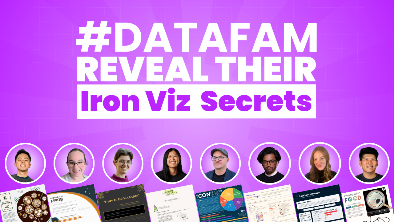
by Sarah Burnett & Fiona Crocker | Co-Founders, Dub Dub Data
Every year, the Tableau Iron Viz Feeder competition stops talented data professionals in their tracks. The blank canvas. The tight timeline. The pressure of creating a viz that stands out amongst hundreds of submissions. But what if you knew exactly what the judges were looking for?
We explored this exact question across two special unDUBBED podcast episodes: Tableau IronViz Secrets: Storytelling, Colour Theory and Cultural Connections, Parts one and two. Across both episodes, we spoke with eight incredible members of the #DataFam who bravely submitted their work to the 2025 Iron Viz Feeder competition. These conversations revealed something fascinating - whilst every visualisation was unique, the principles behind creating winning work are remarkably consistent.
The Iron Viz judges evaluate on three critical pillars: Design, Analysis, and Storytelling. Understanding how these elements work together isn't just helpful for competition entries - it transforms how you approach every data visualisation you create.
TL;DR
Eight Iron Viz Feeder participants reveal exactly how they approached the three judging pillars - Design, Analysis, and Storytelling. Discover what worked for creators who built accessible colour palettes, used AI tools for data preparation, created visual hierarchy that guides attention, and told stories that connect with humans. Whether you're considering your first Iron Viz entry or building better dashboards at work, these insights will transform how you approach data visualisation. The key takeaway? Participation matters more than perfection.
👀 Prefer to watch instead?
We’ve dedicated two entire episodes of our unDUBBED podcast to Tableau IronViz Secrets: Storytelling, Colour Theory and Cultural Connections. Skip the scroll and view Part One and Part Two.
What Iron Viz Judges Look For: Design, Analysis & Storytelling
Iron Viz judges evaluate on three pillars: Design, Analysis, and Storytelling. Understanding how top creators approach each criterion is the difference between a good submission and a finalist-worthy one. Our eight DataFam participants revealed exactly how they tackled each judging pillar to make their vizzes stand out.

Kevin Wee: Tableau Design Principles Meet Cultural Heritage in Data Viz
Kevin Wee is a two-time Tableau Visionary and Tableau Ambassador known for his stunning design aesthetic. His 2025 Iron Viz submission, Nutrition Values of Dim Sum, demonstrates how intentional design choices create visual impact whilst honouring personal heritage.
Kevin's design approach is rooted in graphic design theory that most data professionals never learn. He built his Tableau visualisation using modular grids - columns and rows with deliberate gaps that create perfect alignment throughout. Even more clever was his use of the golden ratio. Since most screens approximate golden rectangle proportions, Kevin designed each scroll to present something visually stunning within that natural frame.
His colour choices avoided the obvious. Rather than using bright red typically associated with Chinese culture, Kevin chose dark green to honour his Cantonese heritage without falling into clichés. But aesthetics alone don't win Iron Viz - accessibility matters. Kevin tested every colour decision with the Colorblindly plugin, ensuring his data visualisation worked for viewers with colour vision deficiencies.
The analytical depth came through Kevin's data collection journey. He started with nutritional data from Hong Kong's Central Food Safety website covering 76 dim sum dishes, then manually researched recipes and cross-referenced ingredient nutritional values from the US Department of Agriculture dataset. This meticulous groundwork enabled his storytelling approach: rather than overwhelming viewers with all 76 dishes, he created a case study examining just 12 dishes in depth.
Kevin's storytelling turned analysis into action. After exploring nutritional values and energy sources, he presented four practical solutions: share meals with friends to split calories, order less, choose healthier alternatives, or simply exercise it off later. This "now what" approach transformed dry nutritional data into insights viewers could actually use.
Kevin's Tableau Iron Viz Tips:
- Design: Use modular grids and golden ratios to create natural visual flow; test all colours for accessibility
- Analysis: Collect comprehensive data, then narrow focus to make it digestible (76 dishes → 12-dish case study)
- Storytelling: End with actionable "now what" solutions that viewers can implement
- Key Takeaway: Test your visualisations with the Colorblindly plugin - accessibility isn't optional, it's essential
Explore Kevin's Tableau Public profile
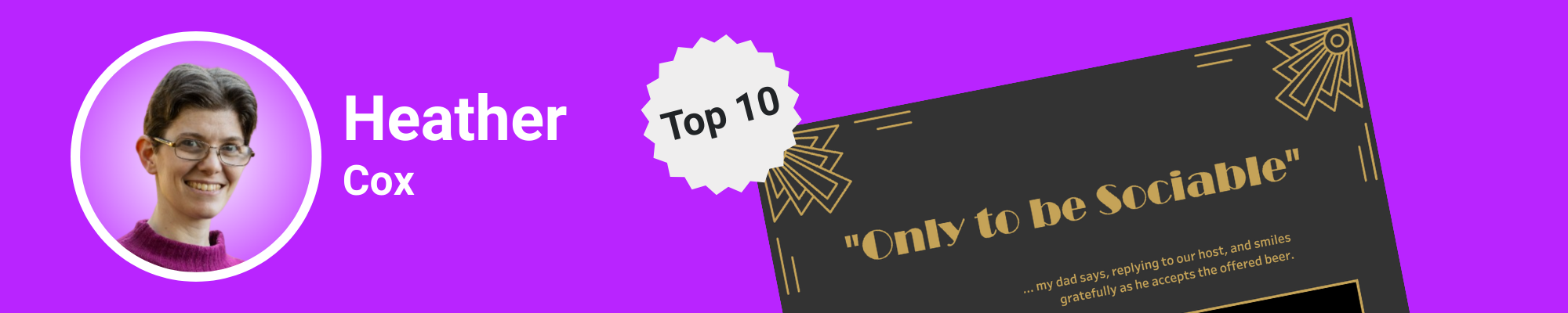
Heather Cox: Problem-Solving Drives Tableau Dashboard Design
Heather Cox is a two-time Tableau Ambassador who leads the Adelaide Tableau User Group. When the Iron Viz theme dropped as "food and drink," she wasn't initially inspired. Then she realised she'd already built the perfect foundation weeks earlier - a viz exploring mocktails. Her Iron Viz submission, Only to be Sociable, tackles something deeply personal: belonging in social situations when you don't drink alcohol.
Heather's storytelling breakthrough came from an unexpected source - a conversation with ChatGPT. She explained her frustration with finding non-alcoholic options when dining out, and the AI pointed out what should have been obvious: that struggle was her story. The title "Only to be Sociable" came from her father's recurring joke when offered a beer - a phrase that perfectly captured the social pressure around drinking.
Her research uncovered a fascinating pattern: in Australia, searches for mocktails spike in the week before Christmas every single year. People were already thinking about this problem - Heather just gave them a solution. The data visualisation explores a crucial question: do you belong if you're not drinking when most people around you do, and only 5% of the menu caters to you?
The design aesthetic landed on Art Deco after considerable exploration. The martini glass, olive-inspired legends, and Rolodex-style indexes all nodded to prohibition-era speakeasies whilst maintaining sophistication. But Heather's design choices weren't purely aesthetic - they served function. She built a mocktail mixer dashboard that lets users browse recipes, select ingredients they already own, and get recommendations for drinks they're only one or two ingredients away from making.
The technical complexity behind that seemingly simple interface is significant. Heather built a random recipe generator - anyone who has tried to create true randomness in Tableau understands why that's difficult. And then she got cheeky: she added an export to CSV button, joking that she was "waiting to be excommunicated from the Tableau community" for it. But the functionality was too valuable to skip.
Heather's Tableau Iron Viz Tips:
- Design: Let function drive aesthetic decisions; use design motifs that reinforce your story
- Analysis: Identify real problems that waste people's time, then solve them with dashboard interactivity
- Storytelling: Find the human thread - ChatGPT can help you identify what's already there
- Key Takeaway: When you solve a real problem, the Tableau community will forgive unconventional features (like that CSV export button)
Explore Heather's Tableau Public profile

Ann Pregler: The Art of Letting Go in Data Visualisation
Ann Pregler is a two-time Tableau Ambassador with two Viz of the Days to her name. Her Iron Viz entry, Packing For Mars, explores what astronauts will eat during the nine-month journey to Mars. The visualisation spans the full 10,000-pixel vertical limit that Tableau allows.
Here's what most people don't know: what you see is only one-third of what Ann originally planned.
Ann initially envisioned three distinct sections - food on the way to Mars, food after arriving on Mars for a 10-year stay, and the orbital mechanics of the journey itself. She spent roughly a day building a beautiful arc diagram showing when planets align for optimal travel. But as she worked through the narrative, she realised something crucial: whilst the orbital mechanics were fascinating, they didn't contribute to the story about food and plant growth during the voyage.
So she cut two entire sections. The arc diagram she loved? Gone. The analysis of 10-year food supplies on Mars? Gone. What remained was a tighter, more cohesive narrative focused on one clear question: how do you feed astronauts on the way to Mars? This editorial discipline is what separates good Iron Viz entries from potential finalists.
Ann's design choices pulled heavily from two sources: vintage NASA posters from the 1970s and 80s, and original typewritten reports from that same era. The dramatic space background at the top came directly from those vintage travel destination posters NASA created to promote space exploration. But Ann showed restraint - she knew that carrying that dramatic dark mode throughout would become distracting rather than helpful.
Instead, she mixed in elements from actual NASA blueprints and reports. The Courier font calls to mind original typewritten documents. Hand-drawn blueprint elements serve as section dividers and labels. Even her chart styling reinforces this aesthetic - the bubble charts use dual-axis techniques to create faint inner circles, making them look slightly hand-drawn whilst maintaining clarity.
The typography hierarchy was carefully managed. Courier is lovely in small doses but becomes difficult to read in large blocks, so Ann paired it with Montserrat for heavier text sections. This balance let her maintain the vintage aesthetic without sacrificing readability - a crucial consideration for accessibility that judges look for.
Ann's analytical approach included pulling data from actual Gemini mission reports written in the 1970s. The amount of food astronauts consumed came directly from those historical documents, grounding her futuristic Mars scenario in real-world data. Her viz examines nutritional values, energy sources from proteins, carbohydrates, and fats, and the ingredients used across different dishes.
Ann's Tableau Iron Viz Tips:
- Design: Pull inspiration from multiple sources, but show restraint - dramatic backgrounds everywhere become distracting
- Analysis: Ground futuristic scenarios in historical datasets; use real mission reports to validate assumptions
- Storytelling: Be willing to cut entire sections if they don't serve the core narrative
- Key Takeaway: The best data storytelling often happens when you let go of beautiful elements that don't serve the story
Explore Ann's Tableau Public profile

Kimly Scott: Hand-Drawn Artistry Meets Data Visualisation Storytelling
Kimly Scott is a three-time Tableau Visionary, Tableau Ambassador, and the creator of 19 Viz of the Days. Her Iron Viz submission, Sunday Dinners, explores the powerful link between food and memory through the lens of Cambodian cuisine.
Kimly's design journey took an unexpected turn thanks to her sister's feedback. Initially, Kimly photographed actual Cambodian dishes her father cooked specifically for the visualisation. She cropped the photos, stylised them, and added them to her viz. But her sister wasn't convinced. "I know you're really good at drawing," she told Kimly. "If you draw the dishes, I think that would make the visualisation look better. It would elevate it."
Kimly was apprehensive. Drawing small ingredients like chillies was one thing, but intricate dishes with multiple components? She worried that whilst she might recognise her drawings as noodle soup, unfamiliar viewers might not. But she tried anyway, starting with papaya salad. When she showed her sister, the response was immediate: "This is so much better. This is amazing."
The hand-drawn aesthetic wasn't just beautiful - it brought passion and love for Cambodian food to life in a way photographs couldn't. And here's the remarkable part: Kimly drew everything using her trackpad in Figma. No iPad. No Apple Pencil. Just her finger on a trackpad. "It does take a while to get used to," she admitted, "but Figma's drawing tool allows me to scale things down if the outline is too thick, or straighten things if I've drawn something a bit wonky."
The colour palette emerged naturally from the food itself. Lots of green dishes - the Numbajok green curry soup, the fresh herbs, the vegetables. These earthy greens became the foundation, creating visual cohesion that tied directly to the cuisine being explored in her Tableau viz.
Kimly's approach to white space and balance is something many DataFam members have noticed across her vizzes. Her secret? Grid lines and intentional spacing. "I use the grid lines when I'm building dashboards," she explained. "Everything is floating - I want to move things around easily. I might say I'm going to put 10 rows of grid line between the heading and the next element, then use that as a measure throughout."
She also exports her work frequently to see it at actual size. Since Tableau doesn't allow zooming in and out whilst designing, Kimly downloads images to get a bird's-eye view. Too much spacing here? Shrink it. Not enough there? Expand it. This iterative practice ensures balance before the final build.
The storytelling foundation came from exploring the neurobiology of food and memory. Kimly researched studies about how food triggers memories, but the data was light - mostly psychological interviews asking people what foods reminded them of childhood. So she made it personal. She brought in her own story about Cambodian food culture, where families sit together and share meals from communal dishes rather than eating from individual plates.
To strengthen the narrative, Kimly asked others in the Tableau community to share their food memories. The human stories added weight to the scientific premise. One example featured sweet basil bringing someone back to time spent with their grandmother. Food memories, Kimly discovered, are almost always tied to people - specific individuals who prepared or shared those meals.
Kimly's Tableau Iron Viz Tips:
- Design: Don't be afraid to hand-draw elements; the personal touch elevates aesthetics beyond what photos can achieve
- Analysis: When research data is light, supplement with personal stories and community contributions
- Storytelling: Make it personal - you know yourself best, and that authenticity resonates with judges and viewers
- Key Takeaway: Use grid lines and frequent exports to master white space and balance; proper spacing transforms good visualisations into stunning ones
Explore Kimly's Tableau Public profile
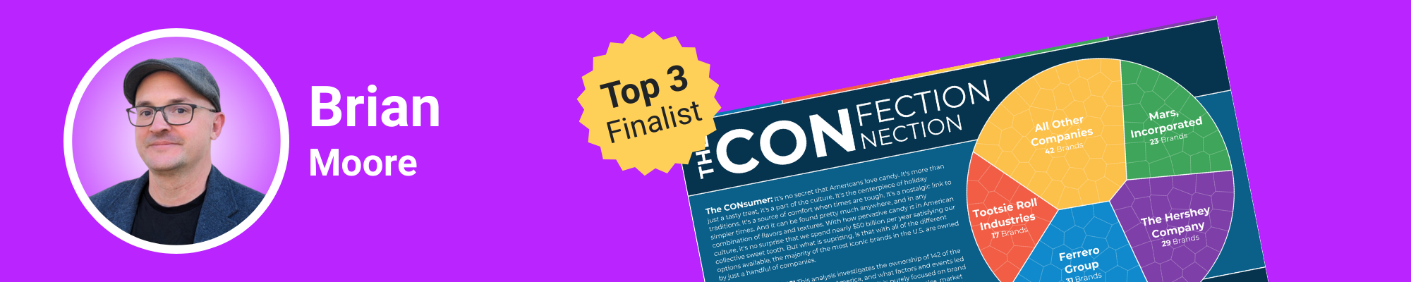
Brian Moore: Building Tableau Dashboard Backgrounds That Scale
Brian Moore is a four-time Tableau Visionary, six-time Ambassador, and leads the Boston user group. His Iron Viz entry, The Confection Connection, traces candy brands through their complex acquisition chains - some switching hands eight or nine times.
But the real innovation isn't visible to most viewers: it's how Brian built his background.
Most people build backgrounds in PowerPoint or Figma, then import them into Tableau. Every time you make a change in your Tableau viz, you go back to the design tool, make changes there, export it, bring it back into Tableau, check the sizing. It's tedious, especially for something like Iron Viz where you're constantly iterating and adding length to your dashboard.
Brian's solution? Build the background directly in Tableau using polygons. Every dark blue section, every lighter blue area, every coloured divider line you see is built in a worksheet using simple polygon shapes. He controls everything with a straightforward Excel dataset that specifies the type of section (divider, full width, split), the height, and what percentage of the dashboard a split should occur at.
The brilliance of this approach reveals itself when you need to add 1,000 pixels to your dashboard. Normally, everything stretches proportionally - you have to resize every single element one by one. But because Brian's content sits in a vertical container on top of the background with fixed heights, adding pixels just creates blank space at the beginning. No stretching. No manual resizing. Just clean expansion that saves time.
This technical foundation enabled one of Brian's most delightful design features: five candy-inspired colour themes users can switch between. Chocolate, cotton candy, candy hearts, gummy bears, and classic. Click one button and the entire visualisation's colour palette transforms. This kind of interactivity would be nearly impossible with traditional background images, but with Brian's polygon approach in Tableau, it's simply a matter of parameter-driven colour changes.
The colour palettes themselves required considerable manual work. Brian couldn't find good candy-inspired palettes online, so he hand-picked colours from various sources and fine-tuned them until they worked together harmoniously. But the effort paid off - the colour-switching feature isn't just fun, it's practical. Imagine showing mock-ups to different clients with different brand colours, all from one Tableau Public template.
Brian's analytical work traced acquisition chains that proved far more complex than anticipated. Following a single candy brand from its creator to its current owner sometimes required documenting eight or nine ownership changes. This level of detail required extensive research, but it enabled the comprehensive data story Brian wanted to tell about industry consolidation.
Brian's Tableau Iron Viz Tips:
- Design: Build backgrounds in Tableau using polygons for ultimate flexibility and iteration speed
- Analysis: Expect complexity - even seemingly straightforward topics like candy acquisitions can require extensive research and data collection
- Storytelling: Interactive colour themes aren't just aesthetic - they can make your work more practical for real-world applications
- Key Takeaway: Building backgrounds in Tableau saves hours of iteration time and enables dynamic colour switching that would be impossible with static images
Explore Brian's Tableau Public profile
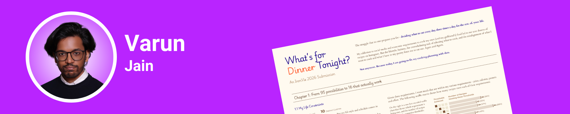
Varun Jain: Using AI for Iron Viz Dataset Preparation
Varun Jain began his Tableau journey in 2021 during the rise of COVID community projects. A two-time Tableau Public Ambassador, his path has taken him from India to Dubai and now to France, where he's pursuing his master's degree whilst working as a data visualisation engineer. His Iron Viz submission, What's for Dinner Tonight, explores the 120+ recipes he's saved on Instagram.
But here's what makes Varun's process fascinating: he used AI tools extensively to overcome one of Iron Viz's biggest barriers - data preparation.
Varun identified a crucial problem many potential Iron Viz contestants face: preparing your own data is one of the biggest entry barriers. You have to gather it from different sources, figure out how to format it properly - it's a significant challenge. Even with his technical background, the manual work of watching 120 Instagram recipe videos, writing down ingredients, and documenting metrics was overwhelming.
So he turned to Claude AI. He fed the tool his dataset of Instagram links and asked it to extract information from captions, analyse video content, and pull metrics like likes and engagement. "It really helped me," Varun explained. "It's not perfect, but it gives you something you can build on." When Claude couldn't handle certain videos, Varun used Comet, an agentic browser by Perplexity, to watch videos and extract caption information.
The combination of these AI tools reduced his data extraction work exponentially. Without them, Varun admitted he wouldn't have been able to participate in Iron Viz at all. His previous Tableau Public visualisations took months of work - condensing that into weeks required leveraging every available tool to make the competition timeline feasible.
Varun's design aesthetic draws inspiration from a visualisation that lives rent-free in his head: CJ Mays' horizontal, chapter-based viz about his CEO diary. "It has great analytics and is still very easy on the eyes," Varun noted. "It goes from left to right in a chapter format. That's my North Star."
His colour philosophy is deliberately restrained. One background colour (a light beige-brown), two accent colours (blue and orange), and shades of those colours for different applications. "It helps me have fewer choices to make," he explained. "It's a bit contradictory, but having less colours makes my life easier when building data visualisations."
The typography hierarchy follows a similar principle. Varun builds specific text styles in Figma first - chapter titles, regular copy, emphasised text - each with defined sizes and weights. This forces him into a hierarchy rather than letting him make ad-hoc font decisions that could dilute visual consistency in his Tableau viz. He uses Courier font sparingly for its typewriter aesthetic but relies on Montserrat for heavier text blocks to maintain readability.
One design element Varun particularly loves is his colour-coded analysis. Throughout the data visualisation, blue represents positive elements and orange represents negative ones. With just two colours performing this consistent function, viewers' eyes naturally focus on what matters without needing to decode a complex legend.
The horizontal format suited Varun's strengths better than long-form scrolling. He admitted he doesn't do long-form well - it's simply not his style. So rather than fighting against his natural design inclinations, he leaned into them. The book-like, left-to-right flow felt more natural and let him create something authentic that judges could appreciate.
Varun's Tableau Iron Viz Tips:
- Design: Restrict your colour palette deliberately (1 background + 2 accents); fewer choices improve consistency across your viz
- Analysis: Use AI tools like Claude and Perplexity to overcome data collection barriers - it's not cheating, it's smart practice
- Storytelling: Design in your natural style rather than forcing yourself into trends that don't suit you
- Key Takeaway: AI tools can democratise Iron Viz participation by removing the biggest barrier to entry - dataset preparation
Explore Varun's Tableau Public profile
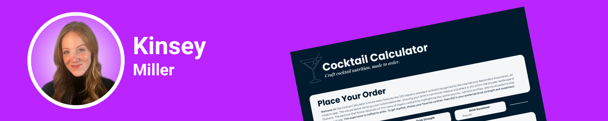
Kinsey Miller: A Tableau Data Visualisation Journey - Coffee to Cocktails
Kinsey Miller started her Tableau journey in 2019, but she considers herself relatively new to the DataFam community. Data visualisation isn't her full-time job - it's her passion. Her Iron Viz entry, Cocktail Calculator, revisits a viz she created six years ago - a coffee nutrition calculator she'd always wanted to remake with better design and analytics.
When the Iron Viz theme dropped as food and drink, Kinsey saw her opportunity. But she wanted to add customisation that her original coffee viz lacked. Cocktails became the perfect vehicle - drinks you can truly customise with different strength levels and sweetness preferences, making for an interactive dashboard experience.
Kinsey's approach to data engineering is what set her submission apart. She started by researching cocktails and discovered the International Bartenders Association, which publishes a list of 102 cocktails they consider the industry standard. "That was an amazing discovery," Kinsey said, "because it gave me this finite universe of cocktails to work within."
She built an Excel dataset with cocktail name, ingredient, and quantity columns, then went through and collected recipes for all 102 cocktails. Next came the painstaking work: creating a separate file where she collected nutritional information for every single ingredient. By week three of Iron Viz, she finally opened Tableau to import the data - a practice that might seem late, but the time invested in data preparation paid dividends.
But here's why the meticulous data preparation mattered: it made building parameters for drink strength and sweetener levels straightforward. Users can adjust the alcohol quantity and the amount of honey or syrup in their drinks, with all nutritional values updating dynamically in the Tableau dashboard. That level of customisation requires rock-solid data architecture.
Kinsey's design journey involved significant iteration. She initially used photos of ingredients and dishes, but the aesthetic didn't gel. After exploring different approaches, she landed on a vintage nutrition label as her design anchor. The dark background with the FDA-style nutritional facts label on the left became her north star for the entire visualisation.
One of her most innovative design elements almost looks like a compressed histogram - bins showing the distribution of drinks by alcohol content, sugar, and fat percentage. But instead of using bar height to show frequency, Kinsey used colour saturation. Darker colours indicate more drinks clustered in that bin. This heat map-histogram hybrid fit her aesthetic better and took up far less vertical space than traditional histograms in Tableau.
She then added triangle pointers beneath each histogram to show where the selected drink falls. This required creating a separate sheet with triangles centred under each bin, then using calculated fields to colour-code them - highlighting only the triangle pointing at the user's selected drink. "I haven't seen anything like this in Tableau before," Kinsey noted. "It was kind of hacky getting there, but when I got it together, I was really happy."
The colour palette came from Tableau's Jewel Brights palette, which she adjusted to grab colours for alcohol (ruby red), sugar (yellow), and fat (light teal). She then used Coolers to build out the full palette, ensuring the dark background and lighter card backgrounds worked together harmoniously. Importantly, she tested contrast ratios to ensure her teal and yellow text remained accessible against darker backgrounds - a practice judges appreciate.
Kinsey's use of Figma for the final design phase revealed how approachable the tool has become. "I was really amazed at how easy it is to use," she said. "The simplest user interface makes spacing so easy." She used light background cards in Figma to create visual separation without harsh border lines, particularly effective in her small multiples chart and recipe card sections.
Kinsey's Tableau Iron Viz Tips:
- Design: Use Figma for final spacing and visual hierarchy - it's more intuitive than you think for Tableau work
- Analysis: Invest time upfront in data architecture; meticulous preparation makes complex dashboard interactivity possible
- Storytelling: Revisit old work with new skills - your growth as a creator makes remakes worthwhile entries
- Key Takeaway: Intentional use of colour matters more than quantity - three colours (alcohol, sugar, fat) maintained consistency without overwhelming viewers
Explore Kinsey's Tableau Public profile
Louis Yu: Gaming History Meets Tableau Data Storytelling for Iron Viz
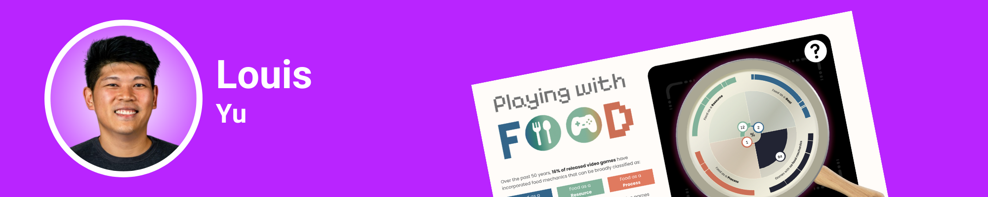
Louis Yu is a first-year Tableau Visionary, three-time Tableau Ambassador, and creator of eight Viz of the Days. He co-hosts the Singapore Tableau User Group and runs virtual community events including Games Night Viz. He's also a podcaster with Secrets of the Viz - one of those rare people who can entertain, educate, and inspire all at once. His Iron Viz submission, Playing with Food, explores how food representation has evolved in video games over 50 years.
When the Iron Viz food and drink theme dropped, Louis struggled initially. Like many in the DataFam community, it wasn't an exciting topic. But as someone deeply embedded in gaming culture, he wondered if he could spin a video game angle around food. At first, it felt forced. Then he dug deeper into the data and realised there was a genuine story to tell that would resonate with judges.
The breakthrough came when Louis discovered that Pac-Man - released in 1980 - was the very first game to feature food. Pac-Man goes around the maze eating dots, grabbing bananas or cherries for power-ups to eat ghosts. That became his narrative anchor, the thread connecting everything from the 1980s video game crash to modern hyper-realistic food rendering in games like Final Fantasy XV.
The video game industry crashed in 1983 when companies copied Pac-Man's blueprint endlessly, putting out new skins on the same gameplay. People got sick of it, and the billion-dollar industry dropped to millions - nearly a 90% crash. It took years to recover. But when it did, technological advancement pushed the needle on how food could be represented in games - not just for gameplay, but for data storytelling and immersion.
Louis's analytical challenge was classification. He needed to categorise how food appears in games: food as a goal (like Pac-Man, where eating is the objective), food as a resource (like Super Mario's mushrooms that grant abilities), and food as a process (like Overcooked or Animal Crossing, where you see the actual cooking). Unfortunately, no dataset on the internet has this classification for analytics purposes.
So Louis manually classified roughly 16,000 games - a massive undertaking for an Iron Viz entry. He had help from ChatGPT and his own gaming knowledge, but that's still an enormous data preparation task. The result was a radial Coxcomb chart showing each category in his Tableau viz, with the ability to explore top-rated games within each classification.
Louis challenged himself technically by avoiding external tools like Data Viz tools that can generate Coxcomb charts for import. He wanted to build everything in Tableau using map layers and trigonometry - skills he specifically wanted to develop through Iron Viz. The effort paid off with a chart that's both analytically sound and visually striking for judges to evaluate.
The design aesthetic pulled heavily from retro arcade vibes. Louis created a pan and induction cooker as his visual motif (built in Figma rather than map layers because drawing gradients with multiple stacked lines would have been too much work). His centrepiece is an arcade machine with Pac-Man eating dots along a timeline - initially planned as a curvy timeline but changed to straight because annotations wouldn't fit on curves in his Tableau dashboard.
Here's where Louis added brilliant interactivity: forward and backward buttons let users click through different story points in gaming history. Start with Pac-Man in 1980, move to the 1983 crash, see the 1986 revival, and continue through gaming evolution. Users can also filter by the three food representation categories to see how each evolved separately over time - a storytelling technique that judges look for.
Louis's research process involved a week of back-and-forth with ChatGPT, feeding it context about how food appears in games and asking it to find threads connecting different eras. He'd validate the AI's output against his own gaming knowledge, feeding good data back in to get better extrapolation. Once he had the narrative thread, he spent two weeks preparing data and writing the story, then two weeks designing and building charts in Tableau.
The data visualisation culminates with Final Fantasy XV, which hired a team of chefs to cook over 100 dishes in the field. They photographed everything for game designers to recreate with stunning realism. Louis includes behind-the-scenes images showing chefs cooking alongside the in-game results - a perfect demonstration of how far food representation has come in gaming analytics.
His closing connects back to the cyclical nature of the industry: with rapid developments in virtual and augmented reality, we might soon play with food in virtual worlds - cooking with goggles on, no actual food required. It's a thought-provoking insight that leaves judges considering the future.
Louis's Tableau Iron Viz Tips:
- Design: Use motifs that anchor your entire narrative (Pac-Man as the thread); challenge yourself to build complex charts natively in Tableau
- Analysis: Don't shy away from massive manual classification tasks if they're necessary to tell your data story properly
- Storytelling: Use AI as a thought partner to find narrative threads, but always validate outputs against your own expertise
- Key Takeaway: Interactive storytelling (clickable buttons to progress through history) lets you pack extensive information into a digestible viz format
Explore Louis's Tableau Public profile
Why Enter Iron Viz: What 8 DataFam Entries Taught Us
Across eight conversations with Iron Viz Feeder participants, a pattern emerged that has nothing to do with winning or becoming a finalist. Every single creator emphasised one thing: the value wasn't in the outcome - it was in pushing themselves beyond what they thought possible with Tableau.
Kevin spent weeks collecting nutritional data he could have skipped. Heather built randomness in Tableau when she could have used a simpler approach. Ann threw away two entire sections she'd already built. Kimly hand-drew dishes with her trackpad when photos would have been faster. Brian built an entirely new background system using polygons. Varun embraced AI tools that felt uncertain. Kinsey meticulously engineered a dataset for 102 cocktails. Louis manually classified 16,000 games.
None of these choices were necessary to make a basic entry. They were all choices to grow as data visualisation creators.
The judging criteria - design, analysis, and storytelling - aren't abstract concepts that only Iron Viz finalists understand. They're frameworks that force you to think differently about your work. Design isn't just making things pretty; it's about creating visual hierarchy that guides your audience's attention through data. Analysis isn't just pulling data; it's about finding the story hidden in complexity. Storytelling isn't just presenting information; it's about connecting with your audience on a human level through data insights.
Every participant we spoke with mentioned the iterative process. The feedback loops from the Tableau community. The moments of doubt. The breakthroughs that came from pushing through uncertainty. Iron Viz isn't just a competition - it's a masterclass in creative problem-solving disguised as a deadline, teaching best practices through experience.
And here's what matters most: none of these creators knew if they'd advance to become Iron Viz finalists when they hit submit. They did it anyway. They shared their work publicly on Tableau Public, knowing it would be scrutinised by judges and the community. They spent weeks on something that might not "win" anything. And every single one of them told us it was worth it - the reason being personal growth and community connection.
If you've been thinking about entering Iron Viz but haven't taken the leap, let this be your permission slip. Your first submission doesn't need to be perfect or finalist-worthy. It needs to exist. The DataFam celebrates effort, growth, and the courage to share your work. The Tableau community that rallies around these submissions - offering feedback, encouragement, and genuine appreciation - is what makes the ecosystem special.
So whether you're a seasoned visualisation creator or someone who's never published to Tableau Public, consider this your invitation. The next Iron Viz Feeder competition will come around, and the theme will be announced, and you'll have a choice: watch from the sidelines or step into the arena and learn firsthand what makes a successful entry.
These eight creators stepped in. And by sharing their processes, they've made it easier for you to do the same. The reason to enter isn't about becoming a finalist - it's about becoming a better data storyteller.
Your Tableau Iron Viz Journey Starts Here
The Iron Viz Feeder competition reveals something profound about data visualisation: technical skills in Tableau matter, but they're not enough. The creators who resonate with audiences - and with judges - are those who combine design principles with analytical rigour and human storytelling. They're the ones who test their work for accessibility, who aren't afraid to cut beautiful elements that don't serve the story, who embrace new tools and techniques even when they're uncertain of the final outcome.
Whether you're building your first dashboard for work or considering your first Iron Viz entry, the lessons from these eight DataFam members apply universally: invest time in proper data preparation, restrict your colour palette intentionally to create visual hierarchy, and always - always - tell a story that matters to humans, not just to data analysts.
The future of data visualisation isn't about who has the most technical Tableau tricks or who becomes an Iron Viz finalist. It's about who can bridge the gap between complex information and genuine human understanding. These eight creators have shown us exactly how that's done through their competition entries, sharing insights that benefit the entire Tableau community.
FAQs
- What are the three judging criteria for Iron Viz Feeder competitions? Judges evaluate Iron Viz submissions on Design (visual hierarchy, colour use, typography, and accessibility), Analysis (data collection, analytical depth, and rigour), and Storytelling (narrative flow, human connection, and actionable insights). All three pillars must work together for a Tableau visualisation to advance to the qualifier stage.
- How long does it typically take to create an Iron Viz Feeder submission? Most participants spend 3-6 weeks from concept to final submission. Data preparation often takes 2-3 weeks alone, followed by 1-2 weeks for design and building the viz in Tableau. However, the timeline varies significantly based on dataset availability and design complexity.
- Do I need to be a Tableau expert to participate in Iron Viz? No. Whilst advanced Tableau skills help, judges value strong storytelling and design principles equally for competition entries. Several participants mentioned using tools like Figma for design work and AI tools like Claude or ChatGPT for data preparation, proving that resourcefulness matters as much as technical Tableau expertise.
- What tools do top creators use alongside Tableau? Common tools for creating successful Iron Viz entries include Figma for background design and spacing, Coolers for colour palette development, the Colorblindly plugin for accessibility testing, Claude or ChatGPT for dataset extraction and research, and Excel for data structuring. The key is using whatever tools help you tell your data story most effectively.
- How important is accessibility in Iron Viz submissions? Extremely important. Judges specifically evaluate accessibility considerations in competition entries. This includes using colour-blind friendly palettes (test with Colorblindly plugin), ensuring sufficient contrast between text and backgrounds, maintaining readable font sizes, providing alt text for charts in Tableau, and avoiding reliance on colour alone to convey data insights.
- Should I use a long-form scrolling format or a horizontal layout for my Iron Viz entry? Use whichever format suits your natural design style and serves your storytelling best. Several successful Iron Viz submissions used horizontal "book-like" layouts whilst others maximised Tableau's 10,000-pixel vertical limit. The format should enhance your narrative and data visualisation, not constrain it.
- How do I choose a topic when the Iron Viz theme doesn't inspire me? Look for unexpected angles or personal connections to make the competition topic work. Several participants initially struggled with the food and drink theme but found success by connecting it to their passions (gaming, cultural heritage, social issues, space exploration). The best Iron Viz submissions often come from making seemingly disconnected topics work together through creative data storytelling.
- Is it okay to use AI tools for data preparation in Iron Viz? Yes. Multiple participants used AI tools like Claude, ChatGPT, and Perplexity to help with dataset extraction and research for their competition entries. The key is always validating AI outputs against your own knowledge and ensuring data accuracy. AI tools can democratise Iron Viz participation by removing barriers to entry and making data preparation more accessible for first-time contestants.
Ready to Learn Tableau Data Visualisation for Competition?
The Iron Viz Feeder submissions we've explored demonstrate something crucial: exceptional data visualisation combines technical Tableau skills, design principles, and human storytelling. Whether you're inspired to enter the next Iron Viz competition or you simply want to create more impactful visualisations for your organisation, having expert guidance makes all the difference in your analytics journey.
At Dub Dub Data, we help organisations and individuals unlock the full potential of their data through compelling visualisations that drive real business outcomes. If these Iron Viz stories have inspired you and you need support creating amazing visualisations in your business, we'd love to help you learn best practices and develop your Tableau skills.
Book a 30-minute discovery call today to explore how we can help you develop visualisation skills, refine your design approach, or transform your organisation's data storytelling capabilities. Let's discuss your specific challenges and create a roadmap that positions you at the forefront of data visualisation excellence - whether that's for Iron Viz or for driving business insights.
Tableau IronViz Secrets: Storytelling, Colour Theory and Cultural Connections, Part One
Follow us on your favourite platform:
🎙️ Unscripted. Uncensored. Undeniably data.
Summary
This episode dives deep into the world of Tableau's IronViz Feeder competition, exploring how top creators transform data into meaningful stories.
The unDUBBED team are delighted to host datafam members: Kevin Wee, Ann Pregler, Heather Cox and Kimly Scott. Each guest shares their process - from concept to design to iteration - revealing the emotional, cultural, and technical layers behind their IronViz entries. You’ll learn how food becomes a canvas for storytelling, how colour guides perception, and why accessibility and personal connections elevate data work.
Whether you're a tenured data viz professional or a newcomer ready to learn, this conversation will spark new ideas, sharpen your design instincts, and fuel your storytelling craft. Part 1 of a 2 part series.
Key Takeaways
IronViz as a Creative Catalyst
- How IronViz challenges participants to merge creativity, analysis, and storytelling.
- The emotional journey behind each entry, including uncertainty, iteration, and breakthrough moments
Storytelling That Resonates
- Why relatable narratives and personal connections make data more accessible and engaging.
- How to transform complex or overwhelming datasets into cohesive stories.
Effective Design Techniques
- How to apply colour theory deliberately to guide perception and highlight insights.
- The use of typography, modular grids, golden ratios, and hand-drawn design elements.
- Why accessibility matters, from colour-blind friendly palettes to alt text and contrast considerations.
Food, Culture and Meaning
- How cultural backgrounds influence the way data creators approach food-themed topics.
- The role of memory, heritage and sensory experience in shaping a visualisation’s narrative.
Iteration and Feedback
- How continuous refinement improves both storytelling and design.
- The value of peer feedback and community support throughout the creative process.
Data Collection and Practical Challenges
- How creators gather and analyse data on nutrition, ingredients, recipes and cultural context.
- When to simplify and when to deepen analysis to serve the story.
Podcast Chapters
00:00 Introduction to Kevin Wee and Iron Viz
03:05 Exploring Dim Sum: A Culinary Journey
07:26 Design Principles in Data Visualization
11:26 Data Sourcing and Analysis Challenges
16:32 Cultural Connection and Personal Insights
19:57 Introduction to Heather Cox and Iron Viz
22:58 The Journey of Creating a Mocktail Visualization
25:31 The Social Impact of Non-Alcoholic Drinks
28:27 Design Inspirations and Technical Challenges
31:22 The Broader Implications of Data Visualization
33:25 Introduction to Anne Pregler and IronViz Submission
34:16 Crafting a Cohesive Story in Data Visualization
37:26 Design Elements and Typography Choices
42:42 Accessibility in Data Visualization
44:15 Intentional Use of Color in Design
46:00 Introduction to Kimley Scott and Her Achievements
47:24 The Inspiration Behind Kimley's Visualization
51:37 Design Choices and Aesthetic Balance
54:34 Techniques for Effective Visualization
57:23 The Art of Storytelling in Visualizations
59:40 Linking Food, Memory, and Emotion
01:04:07 Personal Touch in Data Storytelling
01:06:17 The Passion Behind Creativity
01:06:51 Diving Deeper into Craft and Storytelling
Links
Connect with Kevin on LinkedIn
Connect with Heather on LinkedIn
Connect with Kimly on LinkedIn
Tableau IronViz Secrets: Storytelling, Colour Theory and Cultural Connections, Part Two
Follow us on your favourite platform:
🎙️ Unscripted. Uncensored. Undeniably data.
Summary
Brian Moore, Varun Jain, Kinsey Miller & Louis Yu In Part 2 of our Iron Viz deep-dive, we unpack how top Tableau creators bring data to life through storytelling, colour theory, design aesthetics, and cultural connections.
This episode is best viewed on YouTube or Spotify Video.
This episode explores the creative and technical decisions behind some of the most memorable Iron Viz feeder entries - where food, gaming, and visual storytelling collide. We sit down with four standout data viz designers from the Tableau community: Brian Moore, Varun Jain, Kinsey Miller and Louis Yu.
Together, we explore how they use AI tools for data collection, build custom colour palettes, apply thoughtful typography, and craft narratives that turn raw data into immersive visual experiences. If you’re passionate about data visualization, designing in Tableau, or understanding what it really takes to compete on the Iron Viz stage, this episode is packed with insights you can immediately apply to your next dashboard.
Key Takeaways
Iron Viz as a Creative Playground
• How Iron Viz pushes creators to blend creativity, analytics, and storytelling.
• The emotional highs and lows of designing under pressure - iteration, doubt, breakthroughs.
Storytelling That Connects
• Techniques for transforming complex datasets into clear, cohesive narratives.
• Why personal and cultural connections make data more meaningful and memorable.
Design Aesthetics That Matter
• How to use colour theory to guide attention and highlight insights.
• Choosing an accessible, intentional colour palette (including colour-blind friendly options).
• Typography tips for improving readability, hierarchy, and visual rhythm.
• The role of layout, composition, and hand-drawn elements in creating atmosphere.
Data Collection, AI Tools & Workflow
• How creators gathered data on food, gaming, nutrition, ingredients and cultural context.
• When AI tools streamline research and when manual curation matters.
• Practical lessons from unexpected data challenges.
Food, Culture & Gaming
• How food in video games has evolved across decades.
• Why cultural influences shape visualization choices and storytelling direction.
• How sensory memories - taste, smell, nostalgia - enhance narrative impact.
Community, Feedback & Iteration
• How peer feedback and the wider Tableau community elevate the work.
• Why iteration is the secret to polished design and stronger storytelling.
Podcast Chapters
00:00 Introduction to Iron Viz and Brian Moore
01:34 Building the Background in Tableau
06:06 Colour Customization Techniques
12:18 Data Collection and Storytelling in Visualization
13:44 Varun Jain’s Journey in Data Visualization
15:14 Leveraging AI Tools for Data Extraction
18:48 Design Aesthetics in Data Visualization
24:47 Typography and Hierarchy in Visualizations
28:21 Aiming for the Iron Viz Stage
29:51 Introduction to Kinsey Miller and Iron Viz
31:39 Data Engineering for Iron Viz
35:48 Visual Design Choices and Inspirations
40:53 Colour Theory and Dashboard Aesthetics
47:02 Final Thoughts and Conclusion
49:27 Introduction to Lewis Yu
50:31 Concept Behind Louis’s Iron Viz Submission
54:33 Design Choices & Storytelling
59:13 Food in Video Games: Visual Trends
01:03:21 The Evolution of Cooking in Games
01:06:54 Research Process & Data Collection
01:11:14 Future Insights
01:11:42 Celebrating Creativity & Community
01:12:25 The Long-Term Impact of Participating in Iron Viz
Links
Brian Moore
LinkedIn: https://www.linkedin.com/in/bm111/
Viz: https://public.tableau.com/app/profile/brian.moore7221/viz/TheConfectionConnection/TheConfectionConnection
Varun Jain
LinkedIn: https://www.linkedin.com/in/varunjain113/
Viz: https://public.tableau.com/app/profile/varun.viz.vorkshop/viz/WhatsforDinnerTonightIronViz2026/viz
Kinsey Miller
LinkedIn: https://www.linkedin.com/in/kinseynicolemiller/
Viz: https://public.tableau.com/app/profile/kinsey.n.miller/viz/CocktailCalculator/CocktailCalculator
Louis Yu
LinkedIn: https://www.linkedin.com/in/yulouis/
Viz: https://public.tableau.com/app/profile/louisyu/viz/PlayingwithFoodIronViz/Evolution
Stay connected with news and updates!
Join our mailing list to receive the latest news and updates from our team.
Don't worry, your information will not be shared.
We hate SPAM. We will never sell your information, for any reason.
